
The key to understanding how to optimize landing pages is to embrace one core principle: every element on your page must serve a single, clear goal. Your headline, copy, design, and call-to-action (CTA) need to work in unison to persuade a specific visitor to take one specific action.
Your Blueprint for a High-Converting Landing Page

Before tweaking button colors or A/B testing headlines, you need a solid blueprint. This strategic foundation ensures every change is purposeful. Without a plan, you're merely throwing ideas at a wall, hoping something sticks.
Think of your landing page less as a digital brochure and more as a focused, one-on-one sales conversation. Every good conversation starts by knowing your audience and your objective. Your blueprint must define the page's single primary goal. Are you aiming for demo requests, email subscribers, or direct product sales? Pick one.
A landing page that pulls visitors in multiple directions is a recipe for confusion. In fact, research shows that focusing on a single call-to-action can boost conversions by a staggering 266%. This "one page, one goal" rule is non-negotiable.
First, Diagnose Your Current Performance
To chart your path forward, you must first understand your current position. Begin by analyzing your existing landing pages, not just by glancing at the conversion rate, but by understanding the why behind that number.
Here's a quick diagnostic checklist:
- Message Match: Does your landing page headline mirror the ad or link the visitor clicked? A disconnect here is a primary cause of high bounce rates. Visitors expect consistency.
- User Journey Friction: Where are people abandoning the process? Tools like Hotjar provide heatmaps and session recordings to reveal precisely where visitors get stuck, confused by the layout, or distracted by links that lead away from the main goal.
- Offer Clarity: Can a visitor grasp your value proposition within five seconds? If they have to search for the benefits, you've likely lost their interest.
Before building anything new, you need a clear picture of what’s already working and what’s falling flat.
Core Elements of a High-Performing Landing Page
Every high-performing landing page shares a set of core components. These aren't just best practices; they are the essential building blocks for a page that converts effectively.
With these elements in place, you establish a strong baseline for success. From here, you can test and refine each one to maximize your page's performance.
Build a Strategy That Scales
A common mistake is treating landing page optimization as a one-off project. It’s a continuous process of improvement. An effective strategy involves creating multiple, highly targeted landing pages, not a single generic page for all campaigns.
Consider this: while the average landing page conversion rate is about 6.6%, businesses with 10 to 15 landing pages see 55% more customers than those with fewer than 10. You can explore more insightful landing page statistics on hostinger.com.
This data highlights the significant payoff of diversifying pages for specific campaigns.
This blueprint, defining a single goal, diagnosing your current state, and planning a multi-page strategy, separates professional marketers from amateurs. It transforms optimization from random guesswork into a calculated plan for turning visitors into loyal customers.
Crafting Copy and Offers That Actually Convert
https://www.youtube.com/embed/FzEkHlYt2uA
With the structural framework of your landing page planned, it's time to bring it to life. This is where the magic happens, through the words you choose and the offer you present. A great design may capture attention, but it's the copy and offer that do the heavy lifting of converting visitors into customers.
Your headline is your first and often only chance to grab attention. Treat it not as a title, but as a promise. Its primary job is to instantly reassure visitors who clicked your ad that they've arrived in the right place. We call this message match, and it's essential.
For instance, if your ad promises "Effortless Payroll Software for Small Teams," a vague landing page headline like "The Future of HR" will create a disconnect and erode trust. A better headline would be "The Easiest Way for Small Teams to Manage Payroll," reinforcing the visitor's decision to click.
Getting Inside Their Head with Persuasive Copy
Beyond the headline, your body copy must build a compelling case for your solution. Instead of merely listing features, demonstrate how those features solve your visitor's real-world problems. A classic, effective framework for this is Problem-Agitate-Solve (PAS).
It's simple and it works:
- Problem: Identify the specific pain point your audience faces.
- Agitate: Elaborate on the frustration. Describe the wasted time, money, or effort the problem causes. Make them feel understood.
- Solve: Introduce your product as the clear, obvious solution to their problem.
Expert Insight: People don't buy products; they buy a better version of themselves. Your copy should focus less on what your product is and more on who they will become by using it. Will they be more efficient? Less stressed? More successful? Paint that picture.
Storytelling is a powerful tool here. Instead of stating that your service saves time, tell a brief story about a client who used that reclaimed time to launch a new product line. This makes the benefits tangible and relatable.
How to Structure an Irresistible Offer
Your offer is the core of your landing page, it's the value exchange. Crafting an irresistible offer isn't always about cutting prices; it's about framing the value so effectively that declining feels like a missed opportunity.
Consider these offer-framing examples:
- Booking a Demo: Instead of "Request a Demo," try "Get a Personalized Tour & See How We Can Double Your Leads." One is a task; the other is a high-value promise.
- Downloading a Guide: "Download Our Guide" is functional. But "Get Your Free 5-Step Checklist to Cut Ad Spend by 30%" is superior. Specificity and clear outcomes win every time.
- Offering a Discount: "20% Off" is standard. What about "Join 5,000+ Businesses Saving an Average of $500/Month"? This adds social proof and frames the value in concrete terms.
For a deeper look at these tactics, check out our guide on how to improve website conversion rates.
Building Rock-Solid Trust with Social Proof
Visitors are naturally skeptical. No matter how persuasive your copy, they'll seek proof to back up your claims. Social proof provides this external validation, giving people the confidence to convert.
However, a lazy wall of logos isn't enough. You must be strategic.
By weaving these elements together, you aren't just asking for a conversion; you're earning it by meeting visitor needs, showing undeniable value, and dismantling doubt one proof point at a time.
Designing for a Seamless User Experience

You can write the most persuasive copy in the world, but if your landing page design is chaotic, your efforts are wasted. A great landing page guides visitors toward conversion so effortlessly that the journey feels invisible. This is the power of a superior user experience (UX), it’s intuitive and it just works.
The primary goal is to eliminate friction. Your visitor should never have to wonder, "What do I do next?" Your design must pave a clear, smooth path straight to your call-to-action (CTA).
Establishing a Clear Visual Hierarchy
Visual hierarchy is the art of telling someone where to look without saying a word. It involves arranging elements to communicate their importance, guiding the eye from the most critical message to the finer details. A strong hierarchy makes your page scannable, allowing people to grasp your offer in seconds.
Here's how experienced designers achieve this:
- Size and Scale: Larger elements command more attention. Your main headline should be the largest text on the page, with subheadings and body copy scaling down accordingly.
- Color and Contrast: This is your secret weapon for making the CTA pop. A bright, bold button set against a muted background is nearly impossible to ignore. This is a foundational trick for anyone learning how to optimize landing pages.
- Whitespace: Don't fear empty space. Whitespace, or negative space, is a powerful design tool that reduces clutter and focuses attention on key elements like your sign-up form or CTA button.
Mastering these principles creates a visual flow that directs the user’s gaze exactly where you want it to go. This isn't just about aesthetics; a superior UX design can lead to four times higher performance on landing pages.
Leveraging Visuals and Color Psychology
The images and colors you choose do more than decorate the page; they communicate value and evoke emotion. While poor visuals can be a distraction, the right ones can make your message resonate on a much deeper level.
Ditch generic stock photos. Instead, use high-quality images or videos that show your product in action, feature real customers, or illustrate the successful outcome your visitor desires. Speaking of video, its impact is significant: embedding a quality video can boost conversions by an incredible 86%.
Color also plays a subtle yet critical role in shaping perception:
- Blue: Evokes trust, security, and professionalism. It's a popular choice for financial services and B2B tech companies.
- Green: Often signals growth, nature, and success, working well for "Go" or "Get Started" buttons.
- Orange/Yellow: These high-energy colors create a sense of urgency and optimism, making them perfect for grabbing attention.
The key is to select a color palette that aligns with your brand and reinforces the desired emotional response.
A Pro Tip: Use directional cues to your advantage. An image of a person looking toward your form, a subtle arrow pointing to the CTA, or even the layout of your text can gently guide the user's focus right to the conversion goal.
Prioritizing Mobile and Responsive Design
In today's digital landscape, mobile optimization is non-negotiable. With a majority of internet traffic originating from mobile devices, a clunky, slow-loading mobile page is a guaranteed way to kill your conversion rates.
Responsive design, which automatically adapts your layout to any screen size, is the starting point. True mobile optimization, however, involves a mobile-first approach from the outset.
- Touch-Friendly Elements: Buttons and links must be large enough for easy tapping with a thumb.
- Simplified Navigation: Ditch complex menus in favor of a hamburger icon or a clean, single-column layout to prevent clutter on small screens.
- Concise Copy: Mobile users are scanners. Use shorter headlines, punchy bullet points, and collapsible sections to make content easily digestible.
- Lightning-Fast Load Times: Every second counts. Compress images, minify code, and use good hosting to ensure your page loads in under three seconds.
A seamless experience on every device is crucial, especially when paying for traffic. To learn more about how this impacts ad spend, our guide on PPC for e-commerce offers valuable insights. Creating a smooth journey from ad click to conversion separates thriving landing pages from those that fail.
Using Data to Drive Your Optimization Strategy
Optimizing a landing page without data is like flying blind. You might feel like you're moving forward, but you have no idea if you're heading in the right direction. To truly master landing page optimization, you must stop guessing and start measuring. Treat every element on your page, from the headline to the button color, as a hypothesis to be tested.
The only way to do this effectively is by building a repeatable process for experimentation. This is how you isolate what works, what doesn't, and why, enabling decisions based on real user behavior.
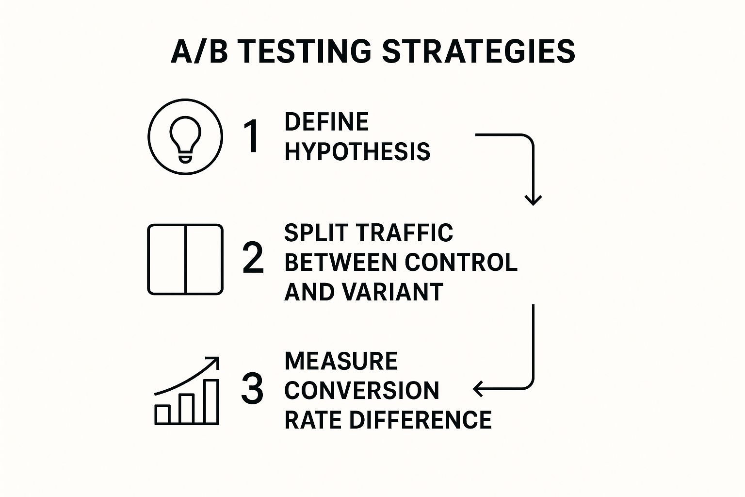
Following a structured approach like this flowchart, from ideation to measuring conversion differences, separates professional optimizers from amateurs. It removes ego and gut feelings from the equation and puts cold, hard data in the driver's seat.
Demystifying the A/B Testing Process
At its core, A/B testing is straightforward. You show two different versions of your page to two similar groups of visitors and see which one performs better. Version A is your "control" (the original page), and Version B is your "variant" (the page with a single change).
The golden rule here is to test one variable at a time.
Many people make the mistake of testing a new headline, a different hero image, and a reworded CTA all at once. If conversions increase, you won't know which change was responsible. Was it the punchy headline or the eye-catching image? You'll never be certain, and you won't learn anything to apply to your next test.
A good test begins with a strong hypothesis, an educated guess based on data or user feedback. A solid hypothesis generally follows this structure:
"By changing [Independent Variable] to [Proposed Change], we will cause [Expected Outcome] because [Reasoning]."
Here’s a real-world example: "By changing our generic 'Submit' button text to a more benefit-driven 'Get My Free Audit,' we will increase form submissions because it clarifies the immediate value the user receives."
This framework transforms a random idea into a testable, measurable experiment.
Prioritizing What to Test for Maximum Impact
With numerous elements on a landing page, it's easy to get lost testing minor details. While button color or font size can make a difference, they rarely lead to breakthrough results.
For the biggest wins, prioritize tests based on their potential impact. Start with elements that most heavily influence a user's decision-making process:
- The Headline and Value Proposition: This is your first and best chance to grab attention. Does it instantly communicate what you do and why it matters?
- The Call-to-Action (CTA): The copy, color, size, and placement of your primary button can dramatically affect click-through rates.
- The Offer Itself: Sometimes the issue isn't the page, but the offer. Is a "Free Demo" what your audience truly wants, or would a "Free Checklist" be more valuable?
- Social Proof: How you display testimonials, logos, and case studies can make or break visitor trust.
Focus on these high-impact elements first. Once they are optimized, you can begin fine-tuning the smaller details.
Moving Beyond A/B Tests with User Behavior Analytics
A/B tests tell you what is happening, but not always why. To gain deeper insights, pair your testing with user behavior analytics tools. These tools offer a window into how real people experience your page.
Heatmaps are incredibly useful, providing a visual aggregate of where users click, how far they scroll, and where their mouse hovers. A heatmap might reveal that users are trying to click a non-linked image or that most visitors never see your CTA.
Session recordings are even more powerful, allowing you to watch anonymized videos of user sessions. You can spot where they hesitate, struggle with a form field, or become confused by your layout.
Understanding this "why" is crucial, especially when you learn that around 48% of visitors leave a landing page without taking any action. Insights from these tools help you find and fix the leaks causing that high bounce rate. For instance, data reveals that personalized CTAs convert an incredible 202% better than generic ones, a fact you can find among other landing page performance statistics on meetanshi.com.
When you combine quantitative data from A/B tests with qualitative insights from behavior analytics, you create a powerful feedback loop. The "why" discovered from heatmaps and recordings fuels your next A/B test hypothesis, sparking a cycle of continuous, data-backed improvement.
One Size Fits None: Customizing Your Landing Page for Your Industry and Audience

A generic landing page is a wasted opportunity. The motivations for a customer to click "Buy Now" on an e-commerce site are completely different from what convinces a CTO to book a demo for a SaaS product. Using the same template for both means leaving money on the table.
True landing page mastery comes from understanding your specific industry and the person on the other side of the screen. It’s about building a page that feels custom-made for them.
The numbers support this. Different industries have vastly different conversion rates because user expectations vary so much. A restaurant might see an 18.2% conversion rate, while e-commerce averages 12.9%, and the more complex SaaS world sees around 9.5%. As you can see from these conversion rate optimization statistics on bloggingwizard.com, what works in one space won’t necessarily succeed in another.
Start by Building Your Buyer Personas
Before writing a single word, you need to know who you’re talking to. This is where buyer personas come in, detailed character profiles of your ideal customer, grounded in real data, not guesswork.
A useful persona goes beyond basic demographics to capture the human element:
- Their Daily Grind: What is their job title? What tasks fill their day, and what professional pressures do they face?
- Their Ultimate Goals: What are they trying to accomplish? What does success look like for them?
- Their Biggest Headaches: What problems are keeping them up at night? What's getting in the way of their goals?
- Where They Hang Out Online: What blogs do they read? Which influencers do they follow? What publications do they trust?
Once you have this profile, you can design an experience that speaks their language and solves their specific problems.
Fine-Tuning Your Strategy by Industry
With your persona in hand, you can make smart, industry-specific decisions about your page's design, copy, and call to action.
For B2B & SaaS Companies:The B2B sales cycle is a marathon, not a sprint. Decisions are calculated and often involve multiple stakeholders. Your page must build confidence and clearly demonstrate ROI.
- Focus: Establish credibility and demonstrate value.
- Copy: Use professional, data-centric language. Talk about efficiency, cost savings, and seamless integration.
- Offer: Provide low-commitment offers with immediate value, such as free trials, in-depth case studies, whitepapers, or a no-pressure "Book a Demo" CTA.
- Social Proof: Crucial in B2B. Showcase logos of well-known clients, detailed testimonials (with names and job titles!), and industry awards.
For E-commerce Brands:E-commerce is driven by emotion and impulse. The goal is to create a seamless, exciting journey from discovery to checkout.
- Focus: Spark desire and make buying easy.
- Visuals: Your product is the star. Use high-resolution photos and videos showing it from every angle and in context.
- Copy: Write compelling, benefit-driven copy. Sell the feeling or lifestyle associated with the product.
- Trust Signals: Alleviate pre-purchase anxiety with prominent security badges, return policies, and customer reviews. For more on this, our guide on how to reduce cart abandonment is a great resource.
Expert Insight: For e-commerce, creating a sense of urgency can be a game-changer. Tactics like countdown timers, limited-time offers, or "Only 3 left!" stock counters tap into our natural fear of missing out (FOMO) and encourage immediate action.
For Lead Generation (Real Estate, Education, etc.):The primary goal is to capture a lead. Since you're asking for personal information, you must offer something genuinely valuable in return.
- Focus: Make a fair trade, their contact info for your valuable resource.
- Offer: Make the offer irresistible. "Get a Free Property Valuation," "Download the Latest Course Catalog," or "Schedule a Free Consultation" are strong examples.
- Forms: Keep forms short. Only ask for essential information to qualify the lead. Consider multi-step forms to request less-sensitive info first, which can feel less intimidating.
Industry Conversion Rate Benchmarks and Strategies
To highlight the differences between sectors, let's review some benchmarks. This table breaks down average conversion rates for key industries and identifies a critical optimization strategy for each.
As you can see, context is everything. When you align your page with your audience's world, you're no longer just marketing, you're having a relevant, persuasive conversation.
Common Landing Page Optimization Questions
As you dive into landing page optimization, certain practical questions will inevitably arise. Let's address some of the most common ones to help you move forward with a clear, confident strategy.
Answering these questions is a key part of figuring out how to optimize landing pages effectively, helping you set realistic expectations and choose the right testing methods.
What Is a Good Conversion Rate for a Landing Page?
This is the million-dollar question, but the honest answer is: it depends. Chasing a universal "good" number is often frustrating. A solid conversion rate is entirely relative to your industry, traffic source, and offer.
While industry benchmarks (e.g., legal at 7%, e-commerce at 3%) provide a rough guide, a smarter approach is to analyze your own context:
- Traffic Source and Quality: Visitors from a loyal subscriber email list will always convert better than those from a cold social media ad. The warmth of the traffic is paramount.
- The Offer's Value: A free checklist is an easy "yes" and will have a high conversion rate. A request for a high-ticket demo requires more commitment and will naturally have a lower conversion rate.
- Your Business Goals: For a B2B company selling a high-value service, a 1% conversion rate could be a massive win. For a low-priced e-commerce product, you might need 10% just to be profitable.
The only benchmark that truly matters is your own. Instead of asking, "What's a good conversion rate?" ask, "How can I improve my current conversion rate?" Focus on steady, incremental improvement.
How Many Elements Should I Test at Once?
The question of how to test is critical. It’s tempting to change everything at once, but this can obscure your results. The number of elements to test depends on your goals and resources.
You have two primary options:
A/B Testing (or Split Testing): This is the classic method. You test one single element at a time, the headline, the CTA button color, the main image. By isolating the change, you can attribute any lift in conversions directly to that modification. It’s clean, methodical, and ideal for clear wins.
Multivariate Testing (MVT): This is a more advanced technique where you test multiple element variations simultaneously. For example, you could test two headlines, two hero images, and three CTA phrases at the same time. The software then identifies the best-performing combination.
For most teams, especially those with moderate traffic, A/B testing is the best choice. It provides clear, actionable feedback. MVT is better suited for high-traffic pages where a more complex experiment is feasible.
How Long Does It Take to See Results?
Finally, the timeline question. With landing page optimization, patience is a virtue, but results can appear on different timetables.
Some improvements yield almost instant results. Fixing a glaring issue, like a broken CTA link or a confusing headline, can boost conversions within days, especially on a high-traffic page. These are the quick wins that build momentum.
However, meaningful optimization is a long-term process, not a one-off project. Achieving a statistically significant result from an A/B test might take several weeks, depending on your visitor volume. You need enough data to ensure the outcome isn't just a random fluke.
Think of optimization as a continuous learning system. Every test, whether it wins or loses, teaches you something valuable about your audience. Over time, these small, data-backed tweaks accumulate into significant performance gains.
Ready to stop guessing and start making data-driven decisions that grow your business? Twelverays is a digital marketing and CRM agency that specializes in creating high-performing digital experiences. We help brands like yours optimize their campaigns and unlock measurable growth. Discover how we can elevate your strategy.
Related Resources
- B2B Search Engine Optimization
- Google Ads Optimization Checklist
- What Is Marketing Attribution?
- Customer Experience Measurement
Related service: Demand generation services.