
To significantly improve your website's conversion rates, you must start with a solid foundation. While it's tempting to jump straight into A/B testing button colors, these small tweaks are ineffective if your site is slow or confusing. The key is to focus on core performance and user experience (UX) first.
By getting these fundamentals right, you create a smooth, intuitive path that naturally guides visitors toward taking your desired action.
Building Your Foundation for Higher Conversions
Before diving into advanced optimization tactics, ensure your website is fundamentally sound. Think of it like building a house, you wouldn't pick out paint colors before the walls and roof are secure. For conversion rate optimization (CRO), that foundation rests on two pillars: site performance and user experience.
This initial phase isn't about guesswork. It’s a methodical process of understanding what your visitors are actually doing and where they’re encountering friction. The goal is to eliminate these roadblocks so the path to conversion feels completely effortless.
Understand User Behavior with Visual Data
Analytics reports provide the "what," but they don't explain the "why." To truly understand why visitors aren't converting, you need to see your website through their eyes. This is where visual behavior analytics tools are indispensable.
- Heatmaps: These tools create a visual representation of where users click, move their cursors, and scroll. They highlight "hot" spots of high engagement and "cold" areas that are being ignored, providing an immediate understanding of on-page behavior.
- Session Recordings: These are screen recordings of real user visits. Watching a few recordings can be incredibly insightful, revealing exactly where people get stuck, hesitate, or encounter an error. It's the closest you can get to sitting next to them as they browse.
For instance, a heatmap might reveal that users are repeatedly clicking a non-linked decorative image, believing it's a button. This is a common design flaw that raw numbers in an analytics report would never uncover.
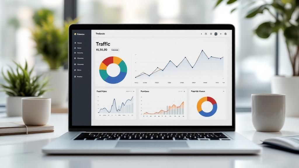
This visual data from Hotjar clearly shows that the "Book a demo" button captures the most attention, validating its critical role. Analyzing these patterns helps you make informed decisions about layout and calls-to-action based on real evidence, not assumptions.
The Critical Role of Site Speed
One of the most significant, and often overlooked, conversion killers is a slow website. In an age of instant gratification, every second counts. If a visitor has to wait for your page to load, you’re creating friction before they’ve even seen your offer.
A fast website is non-negotiable. Performance and visibility are deeply connected, a topic we explore further in our guide on how B2B SEO and SEO services increase sales.
Portent's research makes the stakes concrete. A site that loads in one second converts roughly three times higher than a site that loads in five seconds.
The drop-off is steep, and it gets worse at the extremes. Compared with a ten-second load time, the one-second site converts about five times higher. Optimize your images, clean up your code, and choose quality hosting, and you give your conversion rates a direct boost.
Before diving into complex testing, ensure these foundational elements are in place. The following table summarizes the core pillars for a high-converting website.
Core Pillars of High-Converting Websites
Getting these three pillars right sets the stage for all future optimization efforts, ensuring you're building on a strong, reliable base.
Crafting Persuasive Copy and Compelling CTAs
Once your site’s technical foundation is solid, it's time to focus on what most directly drives action: your words. Your website copy is your 24/7 salesperson. It must do more than just describe what you offer; it has to capture attention, build trust, and confidently guide visitors to the next step.
This starts with your headline. It's your single opportunity to answer the visitor's most important question: "What's in it for me?" Get it right, and they'll stay. Get it wrong, and they're gone.
Writing Headlines That Immediately Convey Value
Your value proposition cannot be a mystery. Vague, jargon-filled headlines like "Innovative Business Solutions" are ineffective because they mean nothing to the average user. They fail to promise a specific, desirable outcome.
A great headline delivers a clear benefit. For instance, a project management tool could say "Manage Your Projects Better," which is adequate. Or it could state, "Finish Projects 30% Faster and Under Budget." The second option is specific, tangible, and speaks directly to a business goal. That's how you capture interest.
If you're struggling with your headlines, try one of these angles:
- Focus on the Outcome: What is the real-world result they will achieve?
- Zero in on a Pain Point: What problem are you solving for them?
- State a Quantifiable Benefit: Use numbers to make your promise concrete (e.g., "Save 10 Hours a Week").
This simple shift, from talking about your features to talking about your customer's results, is the secret to persuasive copy.
Structuring Body Copy to Build Trust and Desire
Your headline has earned you a few more seconds of attention. Now, your body copy must deliver on that promise. Your task is to guide the reader from their current problem to your solution, making them feel understood along the way.
A classic and effective framework for this is Problem-Agitate-Solve (PAS). You start by describing the problem using your customers' own language. Then, you agitate it, you highlight the frustrations and consequences of leaving that problem unsolved. Finally, once they feel the weight of the issue, you present your product as the ideal relief.
Testimonials and social proof are non-negotiable. It's one thing for you to say you're great, but it's far more powerful when a happy customer says it. The Spiegel Research Center at Northwestern found that displaying reviews can raise purchase likelihood by up to 270%.
Place these trust signals near crucial decision points, such as next to a pricing section or a "Request a Demo" button. They provide the final nudge of reassurance a hesitant visitor needs.
The Art of the Compelling Call to Action
Your Call to Action (CTA) is where conversion happens. All your great copy is wasted if your CTA is uninspired. Generic buttons like "Submit" or "Click Here" are passionless and create unnecessary friction.
A powerful CTA is specific, action-oriented, and reinforces the value. Instead of "Get Started," try "Create My Free Account." Instead of "Download," use "Get My Free Ebook." This language is clear, sets expectations, and reminds the user of what they receive in return for their click.
A touch of authentic urgency can also be effective. For a webinar sign-up, a CTA like "Save My Spot!" paired with a countdown timer creates a natural incentive to act now rather than later.
Ensuring Perfect Message Match
One of the quickest ways to destroy your conversion rate is with poor message match. This occurs when your ad promises one thing, and your landing page delivers another.
If someone clicks an ad for "50% Off Running Shoes," they must land on a page where that offer is front and center. If they are directed to your generic homepage and have to search for the deal, they will feel misled and immediately leave.
This seamless connection between the ad and the landing page is critical for maintaining trust and momentum. It's a fundamental piece of the puzzle for anyone serious about how to improve website conversion rates.
Driving High-Intent Traffic for Better Returns
While chasing high traffic numbers is tempting, a flood of visitors doesn't automatically lead to sales. The reality is that more traffic is a vanity metric unless it's the right traffic. To genuinely improve your conversion rates, you need to attract visitors who are already interested and ready to make a decision.
Not all traffic sources are created equal. Some channels are inherently better at delivering users who are deep in the buying journey. By strategically focusing your time and budget on these high-intent sources, you'll see a much healthier return on your marketing investment.
Focus on the Channels That Actually Convert
When you analyze your data, a clear picture often emerges: some traffic sources vastly outperform others. To improve website conversion rates, two of the most powerful areas to concentrate on are direct traffic and email marketing.
Direct traffic, when someone types your URL into their browser or clicks a bookmark, converts at an average of around 2 to 3%. Email marketing is the standout, converting near 5%, the strongest of the major channels.
Both hold up well against the typical rates from organic search (2-4%) or paid search (2-3%), and email leads them all. The message is clear: people who already know and trust your brand are your most likely converters. They aren't just stumbling upon your site; they're returning with a purpose.
Build a Brand That People Remember
Direct traffic isn't a happy accident; it's the direct result of building a memorable brand. When someone bypasses Google Ads comes straight to you, it's the ultimate vote of confidence, a level of trust you can't buy with ads.
So, how do you build that kind of brand authority?
- Become the Go-To Resource: Don't just sell. Publish exceptional content that genuinely helps your audience solve real problems. Be the expert they turn to.
- Deliver a Superior Experience: Every touchpoint matters. From their first click to post-purchase support, the entire experience needs to be smooth, positive, and memorable.
- Be Consistent: Your brand’s voice and personality should feel the same everywhere, on social media, in your emails, and across your website. Familiarity breeds trust.
This creates a powerful growth loop. A strong brand drives more direct traffic, which converts at a higher rate, giving you more revenue to reinvest in enhancing the brand experience. While paid channels are great for attracting new audiences, you can learn more about optimizing them in our guide on PPC for eCommerce.
Master the Art of Email Marketing
Your email list is your single most valuable marketing asset. It's a direct line to an audience that has already given you permission to contact them. However, a generic weekly newsletter is no longer enough.
Your email list is a curated audience of warm leads. Nurturing them with personalized, timely communication is one of the most direct paths to increasing revenue and customer loyalty.
To see a real lift in conversions, you need to implement behavior-driven automation. This means sending emails triggered by a user's actions (or inaction) on your site, making your messages feel personal and relevant.
Here are three high-impact email strategies you can implement immediately:
- Hyper-Personalized Campaigns: Use the data you have. If a customer browsed a specific category or bought a particular product, send them tailored follow-ups. Someone who bought hiking boots might be interested in waterproof socks or a new daypack, not your latest line of dress shoes.
- Strategic Back-in-Stock Alerts: An "out of stock" notice shouldn't be a dead end. Provide an easy way for visitors to receive an email alert when the item is available again. This simple tactic recaptures otherwise lost sales and shows you're attentive to customer demand.
- Abandoned Cart Emails That Actually Work: A single, generic "You left something behind!" email is a start, but you can do better. Try a multi-step sequence. The first email can be a gentle reminder. A day later, send another addressing common barriers like shipping costs or return policies. If they still haven’t purchased, a final email with a small, time-sensitive discount can provide the necessary nudge.
Nail the Final Step: Optimizing Your Checkout and Form Submission Flow
The final moments of the user journey, the checkout or form submission, are where many potential conversions disappear. A visitor can be completely sold on your product but abandon the process because the final step is clunky, confusing, or untrustworthy. Fumbling at the goal line is a costly mistake.
Optimizing this flow isn't about flashy redesigns; it’s about methodically eliminating every point of friction. The goal is to make the last step so easy and secure that clicking "Complete Purchase" or "Submit" feels like the most natural next step. This is where you can significantly improve your website's conversion rate.
Simplify Your Forms to Reduce Friction
Every field you ask a user to fill out is a small obstacle. While it's tempting to gather as much data as possible, long, complicated forms are notorious for killing conversions. Research shows that 27% of users will abandon a form if it's too long or complex.
The golden rule is to only ask for what is absolutely essential. For an e-commerce checkout, is a phone number required at that moment? For an ebook download, is the company name a necessity? Every non-essential field you remove brings a user one step closer to completion.
Think of each field as a micro-commitment. Asking for too many in a row can trigger decision fatigue, causing users to second-guess their choice and abandon the process.
A famous example of this principle comes from Expedia. They removed just one optional field, "Company Name", from their booking form, resulting in a $12 million increase in annual profit. That's the power of simplicity.
This screenshot from the Baymard Institute perfectly illustrates how a checkout form can feel overwhelming with too many fields.

The key takeaway is that every box, from "Company" to a separate "Last Name" field, adds to the user's mental workload, increasing the odds they'll give up.
Build Trust Right at the Point of Decision
As a user is about to enter credit card details or personal information, their skepticism is at its peak. This is your opportunity to address their doubts and build the trust needed to close the deal.
- Offer Guest Checkout: Forcing users to create an account is a well-known conversion killer. Always provide an obvious guest checkout option to smooth the path for new customers.
- Be Transparent with Costs: Surprise shipping fees, taxes, or other hidden costs are the #1 reason for cart abandonment. Display the all-in price as early as possible, ideally on the product page or in the cart summary.
- Display Trust Signals: Place security badges (like SSL certificates), accepted payment logos (Visa, PayPal), and clear links to your return policy directly within the checkout flow. These visual cues provide powerful reassurance that the transaction is safe and the purchase is risk-free.
For lead generation forms, this means including a clear privacy policy link and using button copy that reinforces the benefit. Instead of a generic "Submit," try something that frames the value exchange, like "Get My Site Audit" or "Send Me the Guide".