A great landing page is more than just an aesthetically pleasing design; it's a high-performance engine meticulously engineered for a single, crucial purpose: conversion. While many guides cover fundamental elements, they often stop short of the strategic nuances that distinguish a moderately effective page from one that consistently delivers results. Understanding these advanced principles is critical for transforming advertising spend into tangible ROI and driving sustainable growth.
This article moves past surface-level advice. We will explore 10 essential landing page design best practices that integrate proven psychological principles with precise technical execution. The goal is to provide a comprehensive playbook for creating experiences that not only capture attention but also compel decisive action.
You will learn how to articulate a value proposition that resonates instantly, design a focused layout that eliminates distractions, and leverage trust signals that dismantle user hesitation. Each practice is presented with actionable insights and practical implementation details, making the content accessible for marketers and valuable for seasoned designers. We will explore how to align page elements with traffic sources, optimize for mobile-first interactions, and streamline forms to maximize submissions. Prepare to implement proven techniques that deliver measurable results and elevate your conversion rates.
1. Clear and Compelling Value Proposition
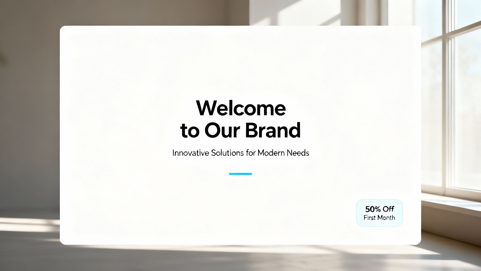
A visitor should grasp the core benefit of your offering within five seconds of arrival. This is the crucial role of your value proposition, arguably the most important element in any list of landing page design best practices. It’s a concise statement that clearly communicates the unique advantage or outcome a customer gets from your product or service. Placed prominently above the fold, it must instantly answer the user's implicit question: “What’s in it for me?”
A powerful value proposition is not just a slogan; it’s a strategic promise that differentiates you from competitors and frames the entire user experience. Without it, visitors lack the context to understand your features, pricing, or call to action, leading to high bounce rates and lost opportunities.
How to Implement a Strong Value Proposition
Crafting a value proposition that converts requires precision and a deep understanding of your audience. Follow these actionable steps to create and refine your own.
- Focus on Benefits, Not Features: Instead of saying, “Our software has an AI-powered analytics dashboard,” say, “Make smarter business decisions in half the time.” The feature is the how; the benefit is the why.
- Be Specific and Concrete: Vague statements like "The best marketing solution" are forgettable. Slack’s former tagline, "Be less busy," was effective because it addressed a universal pain point with a tangible promise.
- Keep It Ultra-Concise: Aim for a single, powerful sentence. Great examples include Dropbox’s "Everything you need for work, all in one place" or Mailchimp’s classic "Send Better Email." These are short, memorable, and crystal clear.
- A/B Test Your Variations: Your first draft is rarely the best. Create several versions of your value proposition and test them with your target audience. Use analytics to see which one resonates most and leads to higher conversion rates.
By dedicating time to this foundational element, you ensure every visitor immediately understands why they should engage with your brand, setting the stage for a successful conversion.
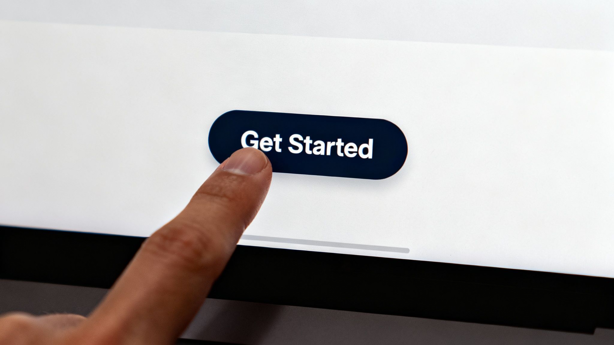
2. Single Primary Call-to-Action (CTA)
Once you’ve captured a visitor’s attention with a strong value proposition, the next step is to guide them toward a single, specific action. This is where a clear and singular call-to-action (CTA) becomes essential. Among the most critical landing page design best practices, focusing on one primary CTA eliminates decision fatigue and channels user intent directly toward your conversion goal, whether it’s starting a trial, downloading a guide, or booking a demo.
The principle is simple: more choices lead to fewer decisions. By presenting visitors with multiple competing options, you dilute their focus and increase the likelihood they will choose nothing at all. A successful landing page is a focused conversion machine, and its engine is a prominent, visually distinct CTA that leaves no room for ambiguity about what the user should do next.
How to Implement a Powerful CTA
Creating a CTA that compels users to click requires a strategic blend of design, copy, and placement. Follow these actionable steps to ensure your button drives conversions effectively.
- Use Action-Oriented, First-Person Copy: Instead of generic text like "Submit," use verbs that imply ownership and value. Phrases like "Get My Free Demo" or "Start My Trial" are far more powerful because they connect the action directly to the user's benefit.
- Design for Visual Prominence: Your CTA button must stand out. Use a contrasting color that pops against the background, ensure it’s large enough to be easily tappable on mobile (at least 44x44 pixels), and surround it with enough white space to draw the eye.
- Make the Benefit Clear: The button copy should reinforce the value proposition. Unbounce’s "Start Building for Free" is effective because it highlights the immediate benefit (building) and removes the risk (free).
- Repeat the CTA Strategically: For longer landing pages, don’t make users scroll all the way back to the top. Place your primary CTA above the fold, below key feature sections, and again near the end of the page to capture users when they are ready to convert.
- Test Everything: Don't assume your first attempt is the best. A/B test different button colors, copy variations, sizes, and placements to discover what resonates most with your audience and maximizes your conversion rate.
3. Mobile-First Responsive Design
With a majority of global web traffic now originating from mobile devices, a mobile-first approach is no longer optional; it's a fundamental component of effective landing page design best practices. This strategy involves designing the mobile user experience first and then progressively enhancing it for larger screens like tablets and desktops. This ensures your core message and functionality are optimized for the most constrained environment, guaranteeing a seamless, fast-loading, and functional experience for every visitor, regardless of their device.
A mobile-first mindset forces you to prioritize what truly matters. By starting with the smallest screen, you strip away non-essential elements and focus on clarity, speed, and conversion-critical content. Pages that fail to render correctly or load slowly on a smartphone see dramatically higher bounce rates, directly impacting your lead generation and sales efforts.
How to Implement a Mobile-First Design
Adopting a mobile-first philosophy requires a strategic shift in your design and development workflow. Follow these steps to ensure your landing pages excel on every screen.
- Design for the Smallest Viewport: Start your design process by targeting the smallest common smartphone viewport (e.g., iPhone SE at 320px width). This constraint helps you focus on the most critical content and user flows.
- Optimize Images and Media: Large media files are the primary cause of slow mobile load times. Compress images, use modern formats like WebP, and implement lazy loading so that images below the fold only load as the user scrolls.
- Test on Real Devices, Not Just Emulators: While browser emulators are useful for quick checks, they can't replicate the real-world performance and touch interactions of a physical device. Test your page on various iOS and Android phones to uncover usability issues.
- Prioritize Performance and Accessibility: Minimize code, reduce server requests, and use tools like Google’s PageSpeed Insights or Lighthouse to check mobile usability, since Google retired the standalone Mobile Friendly Test tool in December 2023. Ensure your design is accessible with sufficient color contrast and tappable elements.
4. Minimal Distraction and Focused Layout
Every element on your landing page should serve a single purpose: guiding the visitor toward the conversion goal. A focused layout with minimal distractions is a cornerstone of landing page design best practices because it eliminates choice paralysis. By removing non-essential links, navigation menus, and competing calls to action, you create a direct, uncluttered path for the user, making it easier for them to say "yes."
This principle is rooted in psychology. When a user is presented with too many options, they often choose none. A focused design respects the user's attention by removing anything that doesn't directly support the primary objective, such as footer links or sidebars, ensuring their focus remains squarely on your value proposition and CTA.
How to Implement a Focused, Distraction-Free Layout
Creating a clean, conversion-centric page requires a disciplined approach to what you include and, more importantly, what you leave out. Follow these steps to streamline your design.
- Remove Standard Navigation: Your main website's navigation menu is the biggest distraction. On a landing page, it offers an easy escape route. Remove it entirely to keep visitors locked into the conversion funnel.
- Leverage White Space: Don't clutter the page with excessive text or visuals. Use ample white space (or negative space) to make your key elements, like the headline and CTA button, stand out and guide the user's eye.
- Limit Choices to One: Your page should have one primary goal and therefore one primary call to action. Avoid adding secondary CTAs like "Follow us on social media" or "Read our blog," as they dilute focus.
- Use Subtle Directional Cues: Guide attention without adding clutter. Simple elements like arrows, lines, or even the gaze of a person in an image can effectively direct a visitor’s eyes toward your form or CTA button.
5. Social proof and trust signals
People are inherently social creatures, often looking to others to guide their decisions. Social proof leverages this psychological principle by showing that other people have chosen and valued your offering. It is a critical component in any list of landing page design best practices because it builds credibility, reduces friction, and reassures potential customers that they are making a safe choice. By displaying testimonials, logos, and user counts, you transform a visitor’s uncertainty into confidence.
This element acts as a powerful shortcut to trust. Instead of relying solely on your own marketing claims, social proof provides third-party validation that your product or service delivers on its promises. For B2B firms and professional services, where trust is paramount, this validation can be the deciding factor that pushes a prospect to convert.
How to Implement Social Proof and Trust Signals
Effectively integrating social proof requires more than just adding a quote; it’s about strategically placing authentic validation where it matters most. Follow these actionable steps to build trust and drive conversions.
- Showcase Authentic Testimonials: Don't just post a generic quote. Include a name, title, company, and a high-quality headshot. This makes the testimonial feel real and relatable. Calendly excels at this by featuring testimonials from recognizable brands near its primary CTA.
- Leverage Quantifiable Data: Numbers are compelling. Highlighting specific figures like "Join over 100,000+ satisfied customers" or "Used by 90% of Fortune 500 companies" provides concrete evidence of your success and scale.
- Display Client and Media Logos: If you’ve worked with well-known companies or been featured in reputable publications, showcase their logos. This "borrowed credibility" immediately elevates your brand's status. Shopify prominently displays logos of major brands using its platform.
- Use Case Studies and Reviews: For more complex offerings, detailed case studies demonstrating tangible results can be incredibly persuasive. Integrating genuine user reviews from platforms like Google is also highly effective. Learn more about how Google reviews impact your business on twelverays.agency.
By strategically weaving these trust signals throughout your landing page, you address user skepticism head-on, making it easier for them to say "yes" to your offer.
6. Fast Loading Speed and Performance Optimization
In the digital world, speed is not a luxury; it's a fundamental requirement. A visitor’s patience is finite, and a slow-loading page is a direct path to a lost conversion. This makes performance optimization a critical component of any list of landing page design best practices. If your page takes more than three seconds to load, you risk losing nearly half of your potential customers before they even see your offer.
Page speed directly impacts everything from user experience and bounce rates to SEO rankings and, most importantly, your conversion rate. Every one-second delay can decrease conversions by as much as 7%. High-performance pages load almost instantly, creating a seamless and professional first impression that builds trust and encourages users to stay and engage.
How to Implement Performance Optimization
Boosting your landing page speed involves a series of technical refinements that collectively deliver a faster experience. Follow these actionable steps to ensure your page is quick and responsive.
- Compress Images Without Sacrificing Quality: Large image files are the most common cause of slow load times. Use tools like TinyPNG or ImageOptim to significantly reduce file sizes while maintaining visual clarity.
- Minimize Code Bloat: Unnecessary CSS, JavaScript, and HTML characters add weight to your page. Use minification tools to strip out comments, spaces, and redundant code, making files smaller and faster to load.
- Leverage Browser Caching and a CDN: Configure your server to tell browsers to store static assets like images and stylesheets locally. Additionally, use a Content Delivery Network (CDN) to serve your content from a server geographically closer to the user.
- Regularly Analyze and Test: Don't guess where the bottlenecks are. Use tools like Google PageSpeed Insights and GTmetrix to analyze your performance and get specific recommendations. Regularly monitoring these metrics, especially your Core Web Vitals on twelverays.agency, is essential for maintaining a high-performance landing page.
By prioritizing a lightning-fast load time, you show respect for your visitor's time and create a frictionless path from click to conversion.
7. Strategic Use of Visuals and Video
In a digital landscape where attention is scarce, visuals are not just decoration; they are a powerful communication tool. High-quality images and videos can convey complex information instantly, evoke emotion, and build trust far more effectively than text alone. This is a core pillar of modern landing page design best practices, as visuals help users mentally picture the benefits of your product or service, making the abstract feel tangible and desirable.
Strategic visuals directly support your value proposition and guide the user’s eye toward the call to action. A well-chosen image or a compelling video can be the difference between a visitor who bounces and one who converts. For instance, a prominently placed video can increase conversion rates significantly, transforming a static page into an engaging, persuasive experience.
How to Implement Visuals Strategically
Selecting and implementing visuals requires more than just filling empty space. Follow these actionable steps to ensure your visual content drives results.
- Prioritize Authenticity Over Stock: Generic stock photos are easily ignored and can even erode trust. Instead, use high-quality, professional photos of your actual product, team, or satisfied customers. Authenticity builds a genuine connection with your audience.
- Keep Videos Short and Punchy: An explainer video should deliver its core message quickly. Aim to keep videos under two minutes to maintain viewer engagement and clearly communicate your value proposition before attention wanes.
- Optimize for Performance and Accessibility: Large media files can slow your page load time, hurting user experience and SEO. Optimize all images and video files for the web. Always include descriptive alt text for images and provide captions for videos to ensure your content is accessible to everyone.
- Mute Autoplaying Videos: Autoplaying videos can capture attention immediately, but unexpected sound is a major annoyance for users. If you use autoplay, ensure the video is muted by default, giving the visitor control over their audio experience.
8. Compelling and Scannable Copy
Even the most stunning design will fail without persuasive copy to guide the user. Your landing page copy must be benefit-focused, clear, and incredibly easy to scan. Visitors rarely read every word; instead, they scan for key information that addresses their needs. This makes scannable text one of the most practical landing page design best practices for holding attention and driving action.
Effective copy connects with the visitor's pain points and clearly articulates how your solution solves their problem. It moves beyond listing features and instead tells a story of transformation. By structuring your text for rapid consumption using subheadings, bullet points, and strategic bolding, you ensure your core message is absorbed, not ignored.
How to Implement Compelling and Scannable Copy
Writing copy that converts is a skill that blends psychology with clarity. Use these proven techniques to make your landing page text both compelling and effortless to read.
- Lead with the Biggest Benefit: Don't bury your primary value proposition. Your headline and opening sentences should immediately state the most significant positive outcome a user will experience.
- Write in the Second Person: Use "you" and "your" to speak directly to the visitor, making the copy feel personal and relevant. This is more engaging than writing from a corporate "we" perspective.
- Use Numbers and Specifics: Quantify your benefits whenever possible. "Increase your revenue by 35%" is far more powerful than "Increase your revenue." Specificity builds credibility and makes your claims more tangible.
- Break Up Text: Employ short paragraphs (2-3 sentences), bullet points for lists of benefits or features, and bold text for key phrases. This structure guides the eye and makes the page feel less intimidating. To delve deeper into how effective copy can boost engagement, explore our guide on how to improve website conversion rates.
- Eliminate Jargon: Speak your customer's language. Avoid industry-specific acronyms or technical terms that could confuse or alienate your audience. Read your copy aloud to check for a natural, conversational flow.
By crafting copy that is both persuasive and easy to digest, you remove friction from the user's journey and make the path to conversion as smooth as possible.
9. Streamlined and Optimized Forms
The form is the final gateway between a visitor and a conversion, making it one of the most critical elements in any list of landing page design best practices. Every field you add introduces friction and another reason for a user to abandon the process. A streamlined form respects the user's time by asking only for essential information, directly boosting completion rates.
A poorly designed form can single-handedly tank an otherwise perfect landing page. Lengthy, confusing, or intimidating forms are conversion killers. The goal is to make the data submission process feel effortless and secure, balancing your need for information with the user's desire for a quick, painless experience.
How to Implement Streamlined and Optimized Forms
Optimizing your forms is a high-impact activity that requires a user-centric mindset. Follow these actionable steps to reduce friction and increase submissions.
- Be Ruthlessly Minimalist: Start with the absolute minimum number of fields required. Slack’s classic signup form, often just requiring an email, is a prime example. Challenge every field: Is this information absolutely necessary for this initial conversion?
- Use Smart Field Types: Reduce typing effort by using dropdown menus, radio buttons, or sliders where possible. For example, instead of a text field for "Country," use a dropdown. This also prevents formatting errors.
- Provide Instant Feedback: Implement inline validation to alert users to errors as they type, not after they hit submit. Clear, helpful error messages like “Please enter a valid email address” are far better than a generic “Error.”
- Craft an Action-Oriented Submit Button: Change the generic "Submit" to something that reflects the value exchange. Use compelling text like “Get Your Free Ebook,” “Start My Free Trial,” or “Schedule My Demo.”
- Delay Asking for More: If you need more information, use progressive profiling to ask for it on subsequent interactions. Collect the basics now and gather more data later once the user is already engaged with your brand.
10. Alignment with Traffic Source and Audience Segmentation
A landing page doesn't exist in a vacuum; its effectiveness is directly tied to where its visitors come from. This is why alignment with the traffic source is a non-negotiable component in any list of landing page design best practices. It’s the practice of ensuring the message a user sees on the landing page is a direct continuation of the message that prompted their click, whether it was a Google Ad, an email campaign, or a social media post.
This concept, often called "message match," creates a seamless and reassuring user journey. When a user clicks an ad for "Cloud-Based Accounting for Freelancers" and lands on a page with that exact headline, they instantly know they're in the right place. This builds trust and reduces friction, directly combatting bounce rates and paving the way for a conversion. Without this alignment, you create a jarring disconnect that erodes confidence and wastes ad spend.
How to Implement Strong Alignment
Achieving a high degree of message match and segmentation requires a strategic approach that connects your campaigns directly to your page content.
- Mirror Your Ad Copy: The headline on your landing page should directly reflect or be a logical extension of the headline from your ad or the link text in your email. This creates an immediate sense of relevance and continuity.
- Use Dynamic Text Replacement (DTR): For PPC campaigns, DTR tools can automatically swap out keywords on your landing page to match the user's search query. This offers hyper-personalized messaging at scale. For instance, if you're targeting both "paid search" and "organic search" keywords, the page can adapt accordingly. You can discover more about the nuances between paid search vs organic search on twelverays.agency.
- Create Segment-Specific Pages: Don't send every visitor to the same generic page. Build unique landing pages for different audience segments, customer personas, or traffic sources (e.g., one for email subscribers, another for LinkedIn ad traffic). Each page should feature imagery, copy, and offers tailored to that specific group.
- Utilize UTM Parameters for Tracking: Tag all your campaign URLs with UTM parameters to meticulously track which sources and segments are converting best. This data is invaluable for optimizing both your ad creative and your landing page variations over time.
10-Point Comparison: Landing Page Design Best Practices
ItemImplementation complexity Resource requirements Expected outcomes Ideal use casesKey advantages Clear and Compelling Value PropositionLow, Medium, copy and positioning work, plus testing Marketing research, copywriting, A/B testing tools Faster engagement, lower bounce, clearer conversionsNew product launches, homepage hero, paid traffic landing pages Immediately communicates benefit and qualifies visitors Single Primary Call-to-Action (CTA)Low, design and placement decisions, copy tests Design resources, basic analytics, A/B testing Higher conversion rates, clearer tracking Signup, trial start, purchase-focused pages Reduces choice overload; simplifies optimization Mobile-First Responsive DesignMedium, High, design + development across breakpoints Front-end developers, QA on devices, performance tools Improved mobile conversions and SEO, lower mobile bounce Mobile-heavy audiences, ads, global traffic Ensures usable experience across devices; SEO benefit Minimal Distraction and Focused LayoutLow, Medium, design simplification and content pruningUX/design time, user testing, analytics Increased conversions, reduced cognitive load Single-offer pages, promo and signup funnels Keeps attention on CTA; faster load and clarity Social Proof and Trust SignalsLow, Medium, gather and format credibility elements Customer testimonials, design, legal/consent checks Higher trust, reduced hesitation, improved conversion lift High-value purchases, unfamiliar brands, B2BBuilds credibility quickly; addresses objections Fast Loading Speed and Performance OptimizationMedium, High, technical work and monitoring Devs/ops, CDN, tooling, ongoing maintenance Faster loads, improved SEO, higher conversion rates High-traffic pages, mobile users, paid campaigns Direct impact on conversions and SEO; cost savings Strategic Use of Visuals and VideoMedium, content production and placement strategy Photography/video production, editing, hosting Greater engagement and clarity, higher time on page Product demos, emotional storytelling, complex offers Makes benefits concrete; boosts engagement and recall Compelling and Scannable CopyLow, Medium, writing and iterative testing Skilled copywriter, editorial review, A/B testing Better comprehension, higher conversions, easier scanning Lead capture pages, SaaS, landing pages with limited time Communicates benefits quickly; aligns with scanning behavior Streamlined and Optimized FormsMedium, form redesign and validation logicDev work, analytics, CRM integration Higher form completion, fewer abandoned leads Lead gen, demos, trial signups Reduces friction; improves data quality and mobile UXAlignment with Traffic Source and Audience SegmentationMedium, High, multiple variants and tracking Landing page variations, analytics, personalization tools Higher relevance, improved Quality Scores and ROIPaid search, email campaigns, segmented audiences Matches user intent; increases conversion and ad efficiency
Putting It All Together: Your Blueprint for High-Converting Pages
We've explored the essential pillars of conversion-focused design, from crafting a magnetic value proposition to optimizing for lightning-fast load times. It’s clear that a high-performing landing page isn't the result of a single brilliant trick or a flashy design trend. Instead, it is a carefully orchestrated system where every element works in harmony toward a single, unified goal: guiding your visitor to take a specific, valuable action.
Mastering these landing page design best practices is about shifting your perspective from merely building a webpage to engineering a conversion machine. This is where art meets science. The visual appeal draws visitors in, but it's the strategic architecture, the psychological triggers, and the seamless user experience that ultimately drive results.
From Theory to Tangible Results
The journey from a good landing page to a great one is paved with data and iteration. Think of the principles we've covered not as a static checklist, but as a dynamic framework for continuous improvement.
- The Core Foundation: Your value proposition and single CTA are the non-negotiables. They form the strategic backbone of your page. If a visitor cannot understand what you offer and what to do next within seconds, all other optimizations are irrelevant.
- The User Experience Layer: Flawless mobile-first design, a distraction-free layout, and rapid loading speeds are the elements that build an invisible, frictionless path for your user. These technical aspects directly impact visitor trust and patience, often determining whether they stay or bounce.
- The Persuasion Engine: This is where you build conviction. Compelling copy, strategic visuals, powerful social proof, and a simplified form work together to answer questions, overcome objections, and build the confidence needed for a user to convert.
The true power emerges when these elements are woven together. For example, your scannable copy reinforces your value proposition, your trust signals validate the claims made in your copy, and your optimized form makes it effortless for a user to act on the desire your page has created. Every piece supports the others.
Your Actionable Path Forward
Knowing these principles is one thing; implementing them is another. The most effective approach is methodical and iterative. Don't feel pressured to overhaul every landing page overnight. Instead, adopt a "test and learn" mindset.
- Start with a Diagnostic: Choose one of your key landing pages. Audit it against the ten best practices discussed. Where are the most significant gaps? Is the CTA vague? Is the mobile experience clunky? Does it lack compelling social proof?
- Form a Hypothesis: Pick one or two areas for improvement. For instance, you might hypothesize that "Replacing our generic stock photo with a client video testimonial will increase form submissions by 15%."
- Test and Measure: Use A/B testing software to run a controlled experiment. Send 50% of your traffic to the original page (Control) and 50% to your new version (Variant). Let the test run until you have a statistically significant result.
- Analyze and Iterate: Did your change work? Why or why not? The results, successful or not, provide invaluable data that informs your next test. This continuous loop of testing and refinement is how you transform average pages into consistent lead-generation assets.
Ultimately, adopting these landing page design best practices is about taking control of your customer acquisition funnel. It’s about making deliberate, data-backed decisions that directly influence your bottom line. By building pages that are not just visually appealing but strategically sound, you create a powerful engine for predictable and scalable growth.
Ready to transform your landing pages from simple web pages into powerful conversion assets? At Twelverays, we specialize in integrating these expert design practices with sophisticated CRM and marketing automation strategies to build end-to-end client acquisition systems for B2B firms. Discover how we can help you build landing pages that deliver measurable results.
Related service: Demand generation services.
Sources checked: marketingdive.com, searchengineland.com, corewebvitals.io.