Key Takeaways: Marketing Dashboard Examples at a Glance
- Marketing dashboard examples are real, working layouts you can copy structurally, whether the source is Looker Studio, Tableau, Power BI, Databox, Klipfolio, Geckoboard, or Supermetrics.
- CMO dashboard examples are executive summaries that lead with pipeline contribution and CAC, not raw traffic or impressions.
- SEO dashboard examples are reporting views that pair keyword rankings with the organic sessions and conversions those rankings actually produce.
- Web analytics dashboard examples are behavior-focused dashboards that track bounce rate, scroll depth, and time on page alongside traffic volume.
- HubSpot marketing dashboard examples are reporting templates built on HubSpot's native contact and deal data, so pipeline numbers update without a manual export.
- A marketing KPI dashboard template is a reusable starting structure, typically five to seven top-line numbers, that a team fills in with its own connected data sources.
- A marketing campaign dashboard template is a narrower view scoped to one initiative, built to answer whether that specific campaign is on pace.
- Digital marketing dashboard examples across every platform in this guide share one habit: a named owner for every number on the screen.
Tired of drowning in spreadsheets and struggling to connect marketing efforts to actual business results? A well-designed marketing dashboard is the solution. It transforms scattered data points from various platforms into a single, cohesive view, enabling you to track performance, identify trends, and make data-driven decisions with confidence. The gap is real: a Gartner survey found that marketing analytics shapes only 53% of marketing decisions, which is exactly the gap a working dashboard is built to close. This clarity is crucial for demonstrating ROI and aligning your team's activities with strategic goals.
This article moves beyond theory to provide concrete marketing dashboard examples from the industry's leading platforms. We've compiled a list of the best template galleries and report examples to help you visualize what's possible and find the perfect starting point for your own needs. Whether you're tracking top-of-funnel content performance, monitoring paid media spend, or analyzing the entire sales pipeline, you'll find a relevant model here.
Each example in our list includes screenshots and direct links, so you can explore these powerful tools firsthand. We'll break down the strategic purpose behind each dashboard, highlighting key metrics and design choices you can replicate. You'll learn not just what to track, but how to present that information for maximum impact, helping you build a command center for your entire marketing operation.
1. Google Looker Studio (Report & Template Gallery)
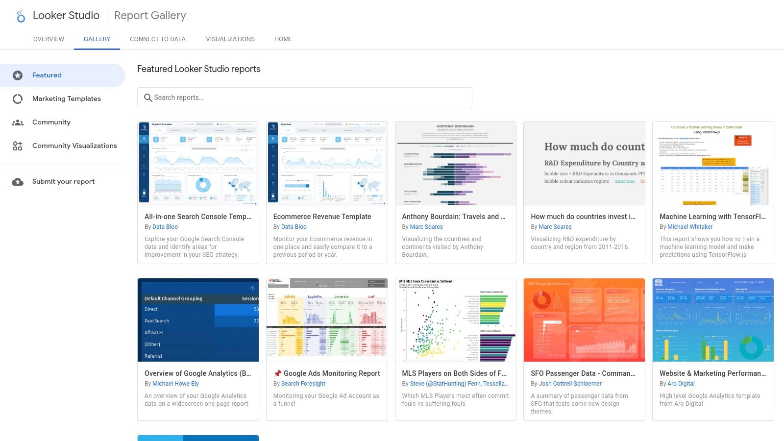
Google Looker Studio is a free, browser-based reporting tool built directly into the Google Marketing Platform. Google Looker Studio's official gallery is an essential starting point for any marketer seeking robust, data-driven dashboard examples. It offers a vast collection of templates from both Google and the user community, covering everything from website analytics and paid media performance to SEO and ecommerce. This makes it a powerful resource for teams wanting to visualize their data quickly, especially those heavily invested in the Google marketing stack.
The platform’s standout feature is its seamless, one-click template integration. You can find a dashboard, select “Make a copy,” and immediately connect your own data sources, significantly lowering the barrier to entry for creating sophisticated reports. For instance, a website performance dashboard can easily pull data from GA4. For a deeper understanding of how that data is collected, you can explore the mechanics of Google Analytics to inform your design.
Strategic Breakdown & Key Features
Looker Studio excels due to its native integration with Google products. Connecting to Google Analytics 4, Google Ads, Search Console, BigQuery, and Google Sheets is straightforward and requires no extra setup.
- Best Use Case: Ideal for B2B and professional services firms needing to quickly build and share performance reports for core digital channels like organic search, Google Ads, and website traffic.
- Unique Offering: The sheer size and quality of the free template gallery are unmatched, providing a launchpad for almost any marketing reporting need.
- User Experience: The interface is intuitive for anyone familiar with Google's tools. The drag-and-drop report builder allows for deep customization beyond the initial template.
Pricing & Access
| Feature Tier | Pricing | Key Features |
|---|---|---|
| Looker Studio | Free | Access to gallery, all Google connectors, report sharing |
| Looker Studio Pro | Published per-user, per-project subscription | Team workspaces, advanced access management, enterprise support |
While the core platform is free, connecting to non-Google data sources like HubSpot, Facebook Ads, or LinkedIn often requires paid third-party connectors. This is a critical consideration for teams with a diverse marketing technology stack. However, for a comprehensive view of your Google-centric efforts, the free version provides immense value, making it a top-tier source for marketing dashboard examples.
Website: https://lookerstudio.google.com/gallery
2. Tableau Exchange, Marketing Accelerators
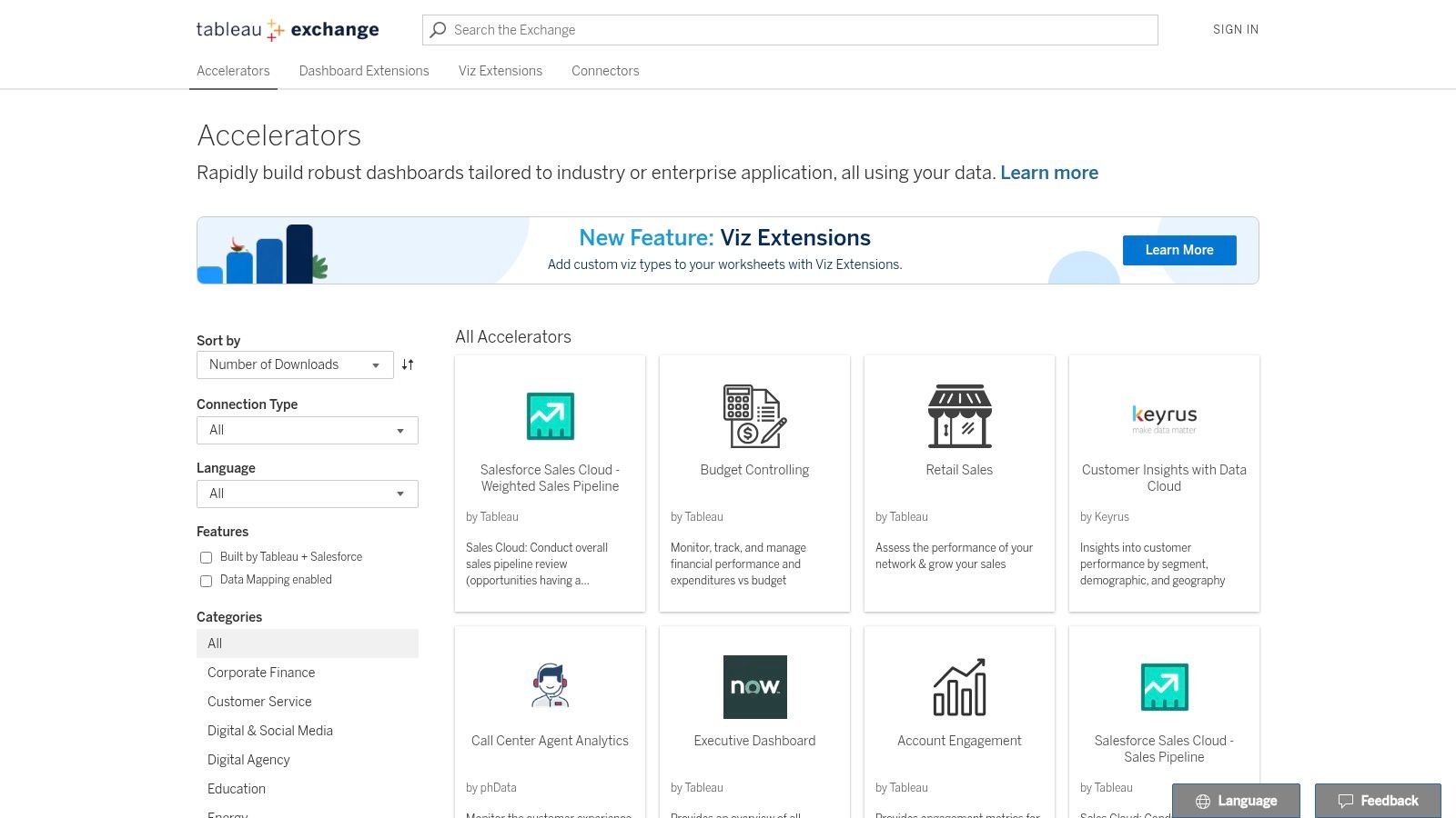
Tableau Exchange is Tableau's official marketplace for pre-built dashboard accelerators, not a separate product. For teams operating within a mature business intelligence ecosystem, Tableau's Exchange offers "Accelerator" dashboards. These aren't just templates; they are production-ready designs created by Tableau, Salesforce, and vetted partners. The gallery provides sophisticated examples for email marketing, paid media, and CRM campaign performance, making it a go-to resource for enterprise-level marketers seeking to jumpstart their analytics.
What sets the Tableau Exchange apart is its focus on enterprise readiness. Each Accelerator includes a downloadable workbook, data mapping instructions, and clear KPI definitions. This framework significantly reduces the time from download to deployment, providing a structured approach that integrates with existing governance models. These dashboards showcase what's possible when you understand the fundamentals of business intelligence and apply them to marketing data.
Strategic Breakdown & Key Features
Tableau Accelerators are designed for rapid deployment and deep analytical capabilities. They provide a robust starting point that can be customized to fit specific business logic and data sources, moving beyond basic reporting into true data exploration.
- Best Use Case: Excellent for B2B organizations and professional services firms with a dedicated analytics function that use Tableau for cross-departmental reporting, especially those leveraging Salesforce.
- Unique Offering: The Accelerators are fully functional workbooks with built-in logic and guidance, designed to connect to common enterprise data sources like Salesforce and Google Ads.
- User Experience: While the dashboards are user-friendly for the end-viewer, customization requires familiarity with Tableau Desktop or Cloud. The Exchange itself is easy to navigate.
Pricing & Access
| Feature Tier | Pricing | Key Features |
|---|---|---|
| Tableau Accelerators | Free to download | Access to all pre-built workbooks, data mapping guides, KPI docs |
| Tableau Platform | Subscription-based (e.g., Creator license) | Required to open, customize, and publish the Accelerator workbooks |
Accessing the templates is free, but using them requires a paid Tableau license. This makes it a powerful resource for existing Tableau customers but introduces a significant cost barrier for those not already invested in the platform. For teams needing high-quality marketing dashboard examples within an enterprise BI tool, Tableau Exchange is an invaluable resource.
Website: https://exchange.tableau.com/en-us/accelerators
3. Microsoft Marketplace (formerly AppSource), Power BI Marketing Templates & Apps
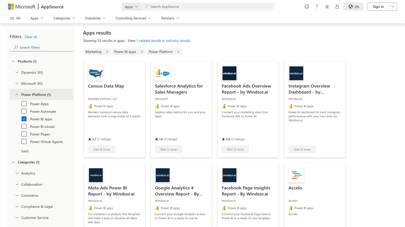
Microsoft AppSource is the app marketplace for Power BI, Dynamics 365, and the wider Microsoft 365 ecosystem. For organizations within the Microsoft ecosystem, AppSource is the go-to marketplace for discovering pre-built Power BI marketing dashboard examples. It functions as an app store for Microsoft business applications, featuring a dedicated marketing category with template apps from various vendors. These solutions cover everything from GA4 overviews and agile marketing analytics to granular reports on paid social media and sales funnels.
The primary advantage of AppSource is its direct integration with Power BI and the broader Microsoft 365/Fabric environment. Users can find a template, deploy it with a few clicks into their Power BI workspace, and connect their data sources. This process leverages Microsoft’s robust enterprise governance and sharing features, making it a secure and scalable option. For those new to the platform, you can explore what Microsoft Power BI is to better understand its capabilities.
Strategic Breakdown & Key Features
AppSource stands out by providing vetted, third-party solutions that are ready to deploy, saving teams countless hours of development time. The marketplace allows you to filter specifically for Power BI apps within the marketing category, streamlining discovery.
- Best Use Case: Excellent for B2B companies and professional services already invested in Microsoft 365 or Azure that need enterprise-grade, shareable dashboards without building from scratch.
- Unique Offering: The one-click installation and provider-managed updates are key differentiators. Once an app is installed, the vendor can push updates, ensuring the dashboard remains current.
- User Experience: While the AppSource interface is straightforward, the experience of individual dashboard templates can vary by vendor. However, deployment into the familiar Power BI environment is consistently smooth.
Pricing & Access
| Feature Tier | Pricing | Key Features |
|---|---|---|
| Free Apps | Free | Basic templates, often with limited data connectors or features. |
| Paid Apps & Trials | Subscription-based (varies by vendor) | Advanced features, multiple data connectors, dedicated support, regular updates. |
A Power BI Pro license ($14 per user per month) or Premium Per User (PPU) license ($24 per user per month) is required to share reports and collaborate. Many paid apps offer a free trial, allowing you to test functionality before committing. AppSource provides a curated collection of marketing dashboard examples designed for the security and scalability demands of the modern enterprise.
Website: https://appsource.microsoft.com/en-us/marketplace/apps?product=power-bi&category=marketing
4. Databox, Marketing Dashboard Examples & Templates
Databox is a dedicated marketing-reporting platform built specifically for pulling multi-source KPIs into one dashboard fast. Databox positions itself as a rapid deployment platform, offering a library of hundreds of pre-built marketing dashboard examples tailored for specific channels and goals. Its gallery is a goldmine for marketers needing to quickly visualize performance across SEO, PPC, social media, and content. This focus on speed and marketing-specific templates makes it an excellent choice for agencies and in-house teams who need actionable insights without a lengthy setup.
The platform’s core strength lies in its one-click integrations and ready-to-use KPI blocks. You can connect sources like HubSpot, Google Analytics 4, or Semrush, select a template, and have a functional dashboard in minutes. This turnkey approach helps teams immediately start tracking the right metrics. You can learn more about which digital marketing performance metrics are most crucial to include to maximize the platform's value.
Strategic Breakdown & Key Features
Databox excels by providing a comprehensive, out-of-the-box solution with over 130 native integrations. It’s built for marketers who need to blend data from multiple platforms, from Ahrefs and Google Ads to Facebook and various CRMs, into a single view.
- Best Use Case: Perfect for B2B marketing teams and agencies that require a fast, cross-channel reporting solution to track campaign performance, lead generation, and content marketing ROI.
- Unique Offering: The combination of a massive template library, goal tracking with automated alerts, and features like TV screen embeds makes it a highly practical tool.
- User Experience: The interface is clean and user-friendly, designed for marketers rather than data analysts. Building and customizing dashboards is straightforward, with a focus on clear data visualization.
Pricing & Access
Databox runs on tiered subscriptions, from a free entry tier up through paid analyst and pro plans to a custom enterprise tier, with cost scaling by data-source connections and dashboards. The plan structure and prices change regularly, so confirm the current figures on the live pricing page before you commit. For deep, marketing-specific reporting, it earns its place as a powerful source for high-quality marketing dashboard examples.
Website: https://databox.com/dashboard-examples/marketing
5. Klipfolio, Marketing Dashboard Examples & Live Gallery
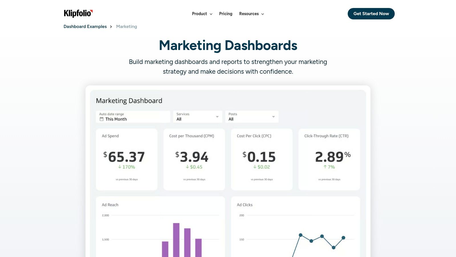
Klipfolio is a business-dashboard platform built for agencies that need white-labeled, client-facing reporting. Klipfolio offers a curated gallery of marketing dashboard examples that serve as both inspiration and functional starting points. The platform showcases pre-built templates for web analytics, social media, SEO, and paid advertising. Beyond static images, Klipfolio provides a live, interactive gallery, allowing users to experience the dashboards as their audience would, making it an excellent resource for visualizing data storytelling.
The platform’s strength lies in balancing pre-built solutions with deep customization. While you can quickly launch a template, Klipfolio’s powerful data modeling features allow you to blend data from hundreds of sources. This capability is crucial for professional services firms that need to create a unified view of the customer journey, from ad click to lead conversion, by combining data from platforms like Google Ads, HubSpot, and Salesforce.
Strategic Breakdown & Key Features
Klipfolio is designed for flexibility, catering to both small businesses and data-savvy agencies that require more granular control over their data presentation and client reporting.
- Best Use Case: Marketing agencies and B2B teams that need to create customized, white-labeled dashboards for multiple clients or internal stakeholders, often blending data from diverse channels.
- Unique Offering: The combination of a live, interactive example gallery with agency-focused features like white-labeling, custom domains, and flexible publishing options.
- User Experience: The platform requires a bit more configuration than simpler tools, but it rewards users with greater control and customization. Its interface is built for those who want to go beyond basic templates.
Pricing & Access
Klipfolio runs on tiered subscriptions, from an entry plan up to higher team tiers, with a 14-day free trial to evaluate it rather than a permanent free plan. Real-time data refreshes and white-labeling sit on the higher tiers. Confirm the current plan that fits your team size and refresh needs on the live pricing page. This makes its gallery a valuable source of marketing dashboard examples for teams at any stage.
Website: https://www.klipfolio.com/resources/dashboard-examples/marketing
6. Geckoboard, Marketing Dashboard Examples
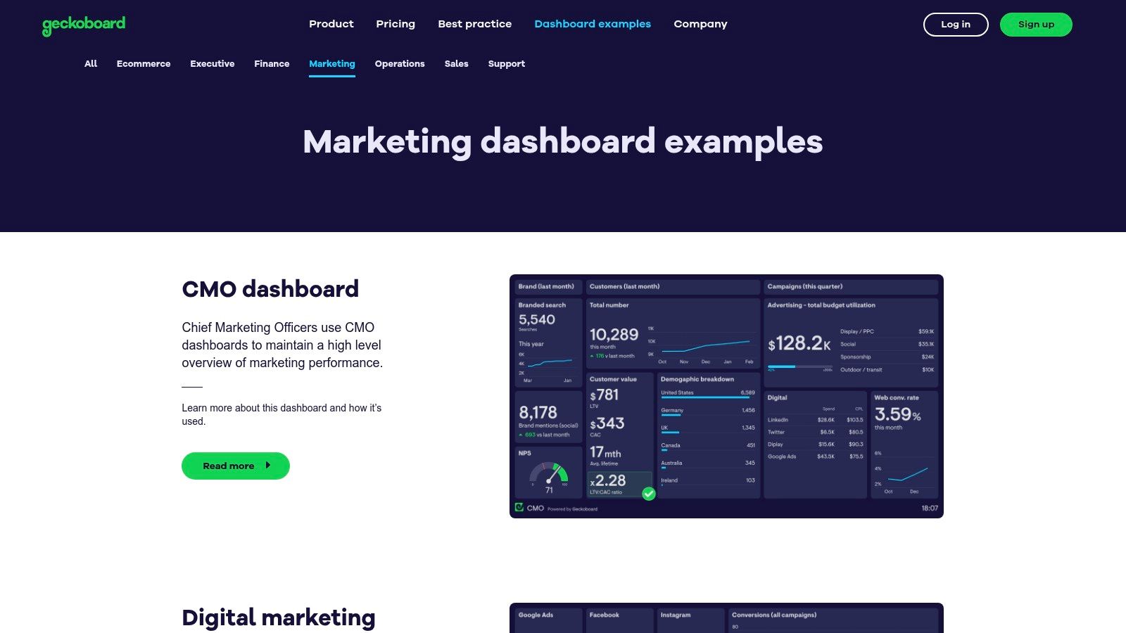
Geckoboard is a real-time KPI display tool built for TV screens and team visibility, not deep analysis. Geckoboard focuses on real-time, high-visibility dashboards designed for team environments. Their gallery of marketing dashboard examples showcases practical use cases for everything from Google Ads and SEO to email marketing and lead generation. This approach makes it an excellent resource for marketing teams who need to keep key performance indicators (KPIs) accessible to everyone, often on a large screen or TV.
The platform is engineered for simplicity and speed. Unlike more complex business intelligence (BI) tools, Geckoboard prioritizes getting essential metrics live within minutes. Its pre-built widgets and over 90 data source integrations mean you can connect your accounts and have a functional dashboard running quickly, which is perfect for busy teams needing immediate operational visibility.
Strategic Breakdown & Key Features
Geckoboard’s core strength is its focus on frontline team visibility and ease of use. It strips away the complexity of deep data modeling to provide clear, actionable, and often real-time snapshots of performance.
- Best Use Case: Ideal for B2B marketing teams needing to display live KPIs in the office on a TV or share daily performance snapshots via Slack or email.
- Unique Offering: The platform's optimization for TV dashboards and its simple sharing workflows are standout features, promoting a data-aware culture.
- User Experience: The editor is incredibly straightforward. It's built for marketing managers, not data analysts, making it fast to create and modify dashboards without extensive training.
Pricing & Access
Geckoboard runs on tiered subscriptions, from an entry plan up through team and enterprise tiers, with cost scaling by dashboards and users. Check the current plan on the live pricing page before you commit. It is less suited for complex data blending or historical analysis than a full BI suite. For teams prioritizing immediate visibility and ease of setup, it is a powerful and efficient tool, and a strong source of marketing dashboard examples.
Website: https://www.geckoboard.com/dashboard-examples/marketing/
7. Supermetrics, Marketing Dashboard & Report Template Gallery
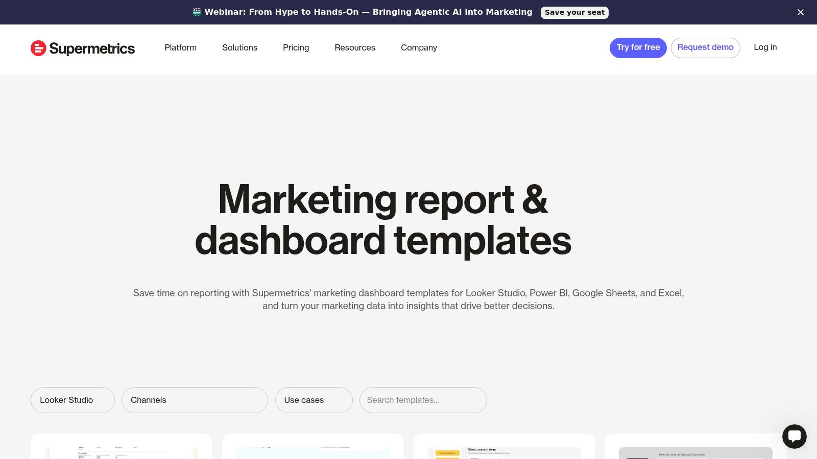
Supermetrics is a data-connector company first and a dashboard-template provider second. Supermetrics combines a rich template gallery with its powerful data connector technology. It offers ready-to-use marketing dashboard templates for platforms like Looker Studio, Google Sheets, and Power BI, covering paid media, SEO, social media, and web analytics. This solution is designed for marketing agencies and in-house teams who need to consolidate data from multiple sources into a unified view without manual data entry.
The core value of Supermetrics lies in its automation. The templates are built to work seamlessly with its connectors, which pull data from platforms like Meta Ads, LinkedIn Ads, TikTok, and HubSpot directly into your reporting tool. This accelerates the setup of comprehensive, multi-channel dashboards and helps standardize KPIs. By automating data pulls, teams can build sophisticated reports that provide a clearer picture of campaign effectiveness. For a deeper dive into this, you can explore marketing attribution models to better inform your dashboard’s structure.
Strategic Breakdown & Key Features
Supermetrics bridges the gap between disparate marketing platforms and your preferred business intelligence tool, making it a crucial component for any data-driven operation. Its templates provide a solid foundation, which you can then customize to fit specific needs.
- Best Use Case: Marketing agencies and B2B SaaS companies that manage multi-channel campaigns (e.g., Google Ads, Meta Ads, LinkedIn Ads) and need to report on consolidated performance without manual CSV exports.
- Unique Offering: The combination of pre-built templates and a vast library of data connectors is its key differentiator. It solves the common problem of data fragmentation.
- User Experience: While the templates are easy to deploy, setting up the connectors requires some initial configuration. Once connected, the data flows automatically, making report updates effortless.
Pricing & Access
Both the templates and the automated data functionality require an active Supermetrics subscription, priced in USD and scaled by destination tool, data sources, and users. Plans run from an entry tier up to a custom enterprise tier. Confirm the current figure on the live pricing page before you commit. For teams looking to eliminate manual reporting and create robust marketing dashboard examples that blend data from across their entire ecosystem, the investment provides a clear return on efficiency and insight.
Website: https://supermetrics.com/template-gallery/reporting-tools/looker-studio
CMO Dashboard Examples, SEO Dashboard Examples, and Web Analytics Dashboard Examples by Team
Every platform above can build any of these views, but the right marketing dashboard examples depend on who is looking at the screen, not which tool renders it. Here is how the most common team-specific dashboards break down, and which platform above tends to fit each one best.
CMO Dashboard Examples: The Boardroom View
CMO dashboard examples are executive-level views that measure marketing's contribution to revenue instead of raw activity volume. A strong marketing KPI dashboard template for this audience narrows the view to five to seven numbers the board actually asks about: Customer Acquisition Cost (CAC), Customer Lifetime Value (LTV), marketing-sourced pipeline, marketing-influenced pipeline, and pipeline velocity. None of that works without clean CRM data behind it: Salesforce's own Tenth Edition State of Marketing research found that marketing teams with fully unified customer data are 42% more likely to respond to customers reliably and 60% more likely to run AI agents at scale. A CMO dashboard has the same dependency: it is only as good as the CRM data feeding it. Google Looker Studio, Tableau, and Power BI (platforms 1 through 3 above) all handle this layer well once connected to Salesforce or HubSpot.
SEO Dashboard Examples and Web Analytics Dashboard Examples: Visibility and Behavior
SEO dashboard examples are reporting views built around keyword rankings, impressions, and the organic sessions those rankings actually convert. Web analytics dashboard examples go one layer deeper: bounce rate, scroll depth, and time on page, so a team can see whether a page ranking on page one is actually holding attention once someone lands on it. Google Looker Studio's native Search Console connector (platform 1 above) is the fastest way to pair both views in a single report; Databox and Klipfolio (platforms 4 and 5 above) both ship pre-built SEO templates for teams that want the same pairing without building the query from scratch.
HubSpot Marketing Dashboard Examples and Marketing Campaign Dashboard Templates
HubSpot marketing dashboard examples are reporting templates built directly on HubSpot's native contact, deal, and campaign data, so a marketing team never has to export a CSV to see how a campaign is performing against pipeline. A narrower marketing campaign dashboard template takes that same data and scopes it to a single initiative, tracking one campaign's spend, leads, and closed revenue in isolation so it doesn't get lost inside a broader monthly report. Databox and Supermetrics (platforms 4 and 7 above) both connect natively to HubSpot for exactly this use case, and it's the same native-connection discipline Twelverays applies in HubSpot implementation work for clients who need the dashboard and the CRM built correctly together.
Across every one of these digital marketing dashboard examples, from the CMO's boardroom view down to a single campaign scorecard, the platform matters less than the discipline behind it: one clear owner per number, connected directly to the source system.
Top 7 Marketing Dashboard Platform Comparison
| Solution | Implementation complexity | Resource requirements | Expected outcomes | Ideal use cases | Key advantages |
|---|---|---|---|---|---|
| Google Looker Studio (Report & Template Gallery) | Low, one‑click copy, minor mapping | Google account; native connectors; paid partner connectors for non‑Google; Pro for advanced governance | Rapid GA4/Ads/SEO dashboards and basic marketing reports | Fast setup for Google‑centric marketing reporting and prototypes | Free start, large template ecosystem, native Google connectors |
| Tableau Exchange, Marketing Accelerators | Medium, data mapping and Tableau configuration | Tableau Desktop/Cloud license; data prep and IT support for enterprise deployments | Production‑ready, highly polished dashboards with KPI definitions | Enterprise BI use, CRM/ads integrations, governed analytics | High‑quality designs, vetted partners, governance‑ready |
| Microsoft Marketplace, Power BI Marketing Templates & Apps | Medium, one‑click deploy plus customization | Power BI Pro/Premium and Microsoft 365/Fabric integration; vendor apps may vary | Integrated Power BI reports with managed updates and tenant governance | Organizations invested in Microsoft ecosystem and Fabric | Familiar Power BI format, easy install, provider updates |
| Databox, Marketing Dashboard Examples & Templates | Low, one‑click integrations and KPI blocks | Tiered subscription (free entry tier through custom enterprise); many native connectors; costs scale with sources | Fast cross‑channel dashboards, goal tracking and alerts | Marketing teams needing quick multi‑channel visibility | Extensive template library, strong marketing focus and integrations |
| Klipfolio, Marketing Dashboard Examples & Live Gallery | Medium, templates plus flexible data modeling | Subscription; hundreds of integrations; optional add‑ons for real‑time/white label | Customizable dashboards with publishing and scheduled reports | SMBs, agencies and teams that need customization and white‑labeling | Good balance of templates and customization, scales with team size |
| Geckoboard, Marketing Dashboard Examples | Low, simple editor and prebuilt widgets | Subscription; ~90+ connectors; pricing scales by dashboards/viewers | Lightweight, real‑time TV and team KPI dashboards | Frontline teams and dashboards for visibility/ops monitoring | Fast to deploy, strong TV/sharing workflows and snapshots |
| Supermetrics, Marketing Dashboard & Report Template Gallery | Low, Medium, templates plus connector authentication | Supermetrics subscription; destination tool (Looker Studio, Sheets, Power BI, warehouse) | Automated multi‑channel data pulls and consolidated reports | Agencies and teams consolidating many ad/analytics platforms | Broad connector coverage, cross‑tool templates, automation |
From Inspiration to Implementation: Building Your Own Strategic Dashboard
We've explored a wide array of powerful marketing dashboard examples, from the highly customizable templates in Google Looker Studio to the robust, enterprise-grade accelerators in Tableau. Each example serves as a blueprint, not just for data visualization, but for strategic thinking. The true value of a dashboard lies not in its aesthetic appeal but in its ability to translate raw data into a coherent story that drives decisive action.
The key takeaway is that an effective dashboard is tailored. The SEO performance dashboard for a B2B SaaS company will prioritize different metrics, like organic lead conversion rates, than a social media dashboard for a professional services firm, which might focus on audience growth and post interaction on LinkedIn. The examples from Databox and Klipfolio demonstrate how dashboards can be customized for specific channels and goals, from PPC campaign monitoring to high-level executive reporting.
Your journey from inspiration to implementation starts with clarity. Before you select a tool, you must define what success looks like for your marketing efforts.
Your Action Plan for Building a High-Impact Dashboard
Moving forward, the goal is to transform these examples into your own strategic asset. Don't just copy a template; adapt its underlying logic to fit your unique business context.
Here are the actionable next steps to guide you:
- Define Your "One Metric That Matters" (OMTM): Before you get lost in dozens of metrics, identify the single most important metric that reflects the health of your marketing objective for a specific period. Is it Marketing Qualified Leads (MQLs), Customer Acquisition Cost (CAC), or pipeline velocity? This becomes the North Star of your dashboard.
- Map Your KPIs to Business Goals: For each primary business objective (e.g., increase client acquisition by 20%), list the 3-5 Key Performance Indicators (KPIs) that directly influence it. This ensures every chart on your dashboard has a clear purpose.
- For flexibility and integration: Google Looker Studio or Supermetrics are excellent for pulling data from numerous sources into one unified view.
- For deep data exploration: Tableau and Power BI offer unparalleled capabilities for complex data analysis and business intelligence.
- For ease of use and quick setup: Databox, Klipfolio, and Geckoboard provide user-friendly interfaces and pre-built templates to get you started quickly.
Ultimately, the best marketing dashboard is one that is used consistently to inform strategy, not just report on past performance. It should spark questions, challenge assumptions, and provide the clarity needed to navigate the complexities of the modern marketing landscape. Use the marketing dashboard examples in this guide as your starting point, but let your own strategic goals be the final architect of your command center.
Feeling inspired but need an expert hand to connect the data dots and build a dashboard that drives real growth? The team at Twelverays specializes in transforming complex marketing data into clear, actionable insights for B2B and professional services firms. Let us help you build the strategic dashboard that aligns your marketing efforts directly with your revenue goals.