When we talk about optimizing the user experience, we're referring to a discipline that goes far beyond aesthetics. It's the strategic process of designing every digital touchpoint to be intuitive, efficient, and genuinely valuable for the user. This means shifting focus from how a product looks to how it works for both your audience and your business.
Why Optimizing User Experience Is a Business Imperative
In the world of B2B and professional services, a superior user experience (UX) is no longer a "nice-to-have", it's a fundamental driver of growth. Yet, many organizations still treat UX as a final coat of paint, a task for designers after the "real" work is complete. This perspective misses the strategic value entirely.
A sophisticated approach to UX is about deeply understanding your users' objectives and then architecting the most seamless, frictionless path for them to achieve those goals. When they succeed, your business succeeds.
This guide will serve as your roadmap to transform your website or application from a digital brochure into a high-performing business asset. We'll explore how to:
- Uncover deep user needs through targeted research and journey mapping.
- Leverage analytics and UX metrics to inform your decisions with hard data.
- Implement conversion-focused design that guides users effectively.
- Foster a culture of continuous improvement through intelligent A/B testing.
The Clear Financial Impact of Great UX
Investing in UX isn't an expense; it's one of the highest-return investments a business can make. The data is compelling. Forrester's widely-cited research found that every $1 invested in UX can return $100: a 9,900% ROI. That figure dates to 2016 and remains the industry's reference benchmark.
This isn't by chance. A smoother, more intuitive experience raises user satisfaction, which lifts conversion. Nielsen Norman Group's research found that increasing your UX development budget by 10% improved conversion by roughly 83% on average, a figure from its 2008 usability ROI study (itself a decline from an earlier 135% average as easy wins get harvested first).
The logic is simple yet powerful: When you make it easy for customers to achieve their goals with your product, they remain loyal, spend more, and become advocates for your brand. This creates a self-reinforcing cycle of growth.
The diagram below illustrates how a direct investment in UX translates into tangible business growth.
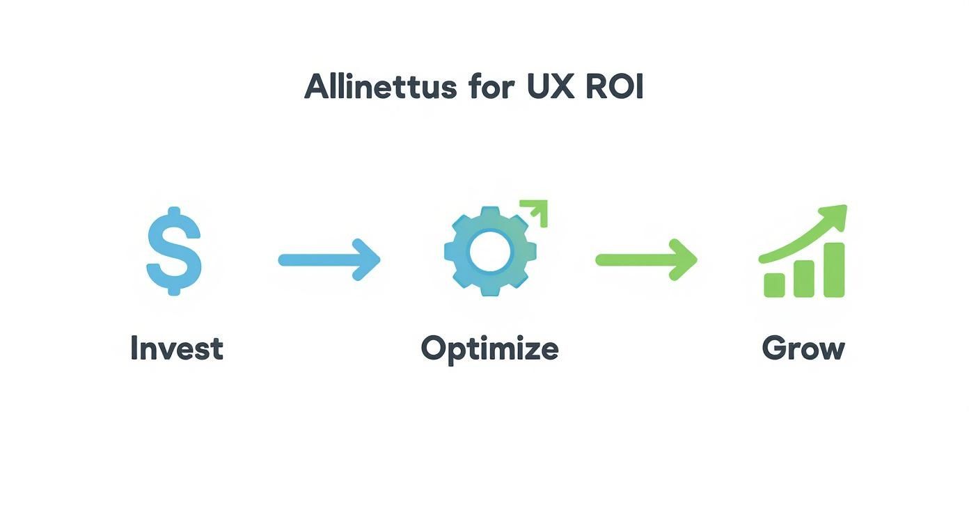
This visual maps the clear path from investment to optimization and, ultimately, to measurable growth, perfectly illustrating why a user-first strategy pays dividends.
To help you get started, here's an overview of the core components we'll cover. Consider these the foundational pillars of any high-impact UX strategy.
Key Pillars of a High-Impact UX Strategy
Each pillar contributes to creating an experience that not only meets user expectations but actively drives your business forward.
Shifting from Aesthetics to Strategy
To truly optimize the user experience, you must change the questions you ask. It’s time to evolve from "Does this look good?" to "Does this work well for our user?"
This subtle shift compels your team to prioritize functionality, clarity, and efficiency alongside visual design.
For instance, a law firm might have a stunning, cinematic website. But if a potential client cannot quickly locate specific legal services or a clear path to book a consultation, the experience has failed. By mapping that client's journey, the firm could identify friction points and restructure the site to create a direct path from landing page to contact form. That strategic thinking is what distinguishes market leaders.
Build Your Foundation with User Research and Journey Maps
To genuinely optimize your user experience, you must abandon assumptions. Designing based on what you think users want is a direct path to wasted resources and frustrating experiences. An exceptional UX strategy is built on one thing: a deep, empathetic understanding of the people you're building for.
This requires moving beyond basic surveys to uncover the "why" behind every click, hesitation, and conversion. In the B2B world, this is critical, as the user is often not the buyer, and the decision-making process involves multiple stakeholders with different motivations. You need to uncover their real-world context, professional pressures, and the specific goals they must achieve using your platform.

Uncovering Actionable Insights with B2B User Research
Effective B2B user research is about gathering qualitative data that directly informs design. It prioritizes depth of insight over massive sample sizes. Instead of another generic survey, consider these powerful methods to get to the heart of what your users truly need.
- Stakeholder Interviews: Speak with the individuals who influence the decision around the user, such as procurement managers, IT security personnel, and department heads. Understanding their distinct concerns, budget, integration challenges, and compliance, is key to designing a solution that works for the entire organization.
- Contextual Inquiries: Go beyond a simple screen-share. A contextual inquiry involves observing a user performing their job in their actual work environment. This is where you'll see their clever workarounds, notice their frustrations firsthand, and uncover pain points they might not even know how to articulate.
- Competitor Analysis (Through a UX Lens): Don't just list your competitors' features; analyze their user flow. Sign up for free trials and document the entire onboarding process. Where do they excel? Where does the experience feel clunky or confusing? This provides a clear benchmark and highlights opportunities to create a superior experience.
These methods provide the raw material for user-centered design, replacing guesswork with evidence and ensuring your efforts solve real problems for real people.
Visualizing the Path with Customer Journey Maps
Once you have this rich research data, a customer journey map is the tool to transform insights into a coherent strategy. Think of it as a visual narrative of a user's entire interaction with your company, from initial awareness to becoming a loyal advocate.
A journey map forces you to view your product through the user's eyes, detailing each stage, touchpoint, action, and emotion. For a B2B SaaS platform, this is invaluable.
The real power of a journey map is its ability to expose moments of friction. It shows you exactly where the experience breaks down, where a user gets confused, frustrated, or gives up. These friction points are your greatest opportunities for improvement.
Imagine mapping the journey of a procurement manager evaluating your software. You would visualize every step:
- Awareness: They first hear about your solution from a colleague or see it mentioned in an industry publication.
- Consideration: They visit your website, immediately looking for the pricing page and security documentation.
- Evaluation: They attempt to request a demo for their team. How easy is it to schedule? How long until they hear back?
- Purchase: They begin the complex process of securing budget approval and navigating legal review.
- Onboarding & Adoption: Their team is finally onboarded. Is the process intuitive or overwhelming?
- Advocacy: After a positive experience, they recommend your platform to another department.
By mapping this out, you can pinpoint specific pain points almost immediately. Perhaps the security documentation is buried, or the demo scheduling tool is cumbersome. For a deeper dive, explore our complete guide to B2B customer journey mapping.
This foundational work, research and mapping, is non-negotiable. It provides the strategic clarity needed to make meaningful design decisions, ensuring every change is grounded in a genuine understanding of your user's reality. Without it, you aren't optimizing; you're just guessing.
Use Analytics and AI for Smarter UX Decisions
User research and journey maps provide the "why" behind user actions. To truly refine the user experience, you must pair these qualitative insights with hard, quantitative data. In the high-stakes B2B landscape, guesswork is a luxury you cannot afford. Data-driven improvements require a granular approach to behavioral analytics and AI-powered tools.
This isn't about chasing vanity metrics like page views. It's about focusing on UX metrics that signal whether a user is succeeding or becoming frustrated. Data tells a story; your job is to find the plot holes where users get stuck and turn them into opportunities.

Go Beyond Surface-Level Metrics
Traditional analytics are a starting point. They tell you what happened but often omit the crucial why. To get that deeper understanding, you need behavioral analytics tools that reveal the user's struggle as it unfolds.
These tools offer a direct window into the user session, allowing you to diagnose problems with precision. Instead of guessing why half your leads abandon the sign-up form, you can watch it happen.
- Heatmaps: These tools create visual representations of clicks, taps, and mouse movements, showing exactly where users focus their attention. A heatmap might reveal that users are trying to click on a non-interactive graphic, a clear design flaw.
- Session Replays: These are invaluable. They provide anonymized recordings of real user sessions, allowing you to see where people hesitate, get confused, or encounter bugs you never knew existed.
- Funnel Analysis: This tracks users through a critical workflow, such as from a landing page to a submitted demo request. It immediately highlights the exact step where you're losing the most people, so you know precisely where to focus your optimization efforts.
Imagine a professional services firm uses a heatmap on its "Contact Us" page and discovers that visitors are hovering over team photos but not clicking the "Submit" button. This insight might lead them to test a new layout that places the contact form front and center, solving a user problem and boosting leads.
The Metrics That Truly Matter
To make sense of this data, you must connect it back to business objectives. While every company's KPIs differ, a few core UX metrics provide a solid foundation for measuring what’s working.
Don't get lost in a sea of data. Tie your UX metrics directly to business objectives. A lower Time on Task isn’t just a UX win; it’s a business win because it means your platform is more efficient.
Here are some of the most critical UX metrics and the tools you can use to track them.
Essential UX Metrics and The Tools to Track Them
This table outlines core metrics that offer a balanced view of user experience, combining behavioral data (what users do) with attitudinal data (how users feel).
Understanding how Google Analytics works is an excellent first step, as it forms the backbone for capturing much of this crucial data.
Harnessing AI for Personalized Experiences
The next frontier in UX is artificial intelligence. AI enables you to move from a one-size-fits-all website to a dynamic, personalized experience that adapts to each user in real time.
For B2B platforms where users have vastly different roles and objectives, this is a game-changer. An AI-driven system can analyze a user's behavior and subtly adjust the interface to better suit their goals.
For example, an AI could recognize that a user is struggling with a complex feature and proactively offer a tutorial video or a link to a relevant knowledge base article. This transforms a moment of potential frustration into an opportunity to engage and educate.
Behavioral analytics and AI personalization are transforming how we approach UX. By 2026, more brands rely on these tools to move beyond basic metrics and truly understand user motivations. One SaaS company used session replays to pinpoint onboarding friction, then tweaked its process to help users hit key milestones 39% faster. You can find more insights on these UX trends on Microsoft's blog. By blending hard data with intelligent automation, you can build an experience that feels individually tailored, driving engagement and satisfaction.
Weaving Insights into a Conversion-Focused Design
After conducting user research and analyzing data, it's time to translate those insights into tangible design improvements. This is where you shift from diagnosing problems to actively building solutions, shaping an interface that not only looks good but feels effortless and guides users toward their goals.
A high-converting design isn’t about flashy animations or trendy layouts. It's about clarity, intuition, and ruthlessly eliminating every point of friction between your user and their objective.

Building a Blueprint with Information Architecture
Before a single pixel is placed, users interact with your site's underlying structure. A solid information architecture (IA) is the invisible backbone of a great user experience. If people cannot find what they're looking for quickly and predictably, the design's beauty is irrelevant, they will leave.
Think of it like a house blueprint that dictates where rooms go and how they connect. For a B2B SaaS company, this means organizing features, pricing, and case studies in a way that makes sense to different user personas. A procurement manager and a lead developer have different priorities, and your site’s structure must cater to both.
Designing CTAs That Actually Get Clicked
Your calls-to-action (CTAs) are the make-or-break moments in the user journey. Weak, generic CTAs like "Submit" or "Click Here" kill conversions by creating uncertainty. The user's next action should feel like an obvious, compelling choice.
The best CTAs excel in three areas:
- Clarity: The button text must clearly state what happens next. Replace "Learn More" with something specific like "Get Your Free Demo" or "Download the Q3 Report."
- Contrast: Your CTA must stand out visually. Use a color that draws the eye and makes it impossible to miss.
- Context: The CTA should appear at the logical conclusion of a thought. A "Request a Quote" button is perfect on a pricing page but feels jarring on a blog post about industry trends.
By thoughtfully designing these interaction points, you actively guide users toward conversion. For more on this topic, check out our deep dive into landing page design best practices.
Don't Let Poor Performance Kill Your Design
Even the most brilliant, intuitive design is useless if the website is slow, buggy, or unusable on a phone. Technical performance is a fundamental part of the user experience. Every glitch and every second of load time erodes trust and sends prospects to your competitors.
A two-second delay in page load sharply raises bounce and abandonment. On mobile, 53% of visitors leave a page that takes longer than three seconds. Flawless technical execution isn’t a luxury; it’s the price of entry for earning a user's attention and trust.
To ensure a smooth experience, focus on these technical pillars:
- Page Speed: Compress images, minify code, and use effective caching. A fast site feels professional and shows you respect the user's time.
- Mobile Responsiveness: With more than half of all web traffic coming from mobile devices, your site must work perfectly on any screen. Buttons must be tappable, and text readable without pinching or zooming.
- A Bug-Free Experience: Nothing screams "unprofessional" like a broken link or a malfunctioning form. Regularly test critical user paths to eliminate frustrating bugs.
Designing for Everyone with Accessibility
Finally, a truly great user experience is an inclusive one. Designing with accessibility in mind is a smart business decision that opens your site to a wider audience and improves it for everyone.
Simple practices like adding alt text to images, ensuring strong color contrast, and enabling keyboard navigation create a more robust and user-friendly interface for all. Committing to inclusivity enhances your brand's reputation and taps into a market your competitors may be ignoring. It's a hallmark of true user-centric design.
Validate Your UX Through A/B Testing and Experimentation
Optimizing user experience is not a one-time project; it's a continuous cycle of learning, tweaking, and refining. All the user research and analytics in the world provide an excellent starting point, but even the most well-informed design ideas are ultimately educated guesses. You won't know for sure until you test them.
This is where a culture of experimentation becomes your greatest asset. It moves you from subjective debates about "what looks better" to objective, data-driven decisions about what actually works better. It is the final, crucial step in turning user insights into measurable business growth.
Building a Strong Hypothesis
Every good experiment starts with a solid, testable hypothesis. A weak one, like "Changing the button color will increase clicks," is a shot in the dark. A strong hypothesis is born from the data you’ve already gathered.
It should follow a clear structure: "Because we observed [data/insight], we believe that changing [element] will result in [outcome]. We will measure this using [metric]." This framework connects your proposed change to a specific user problem and a tangible business goal.
For instance, imagine your funnel analysis shows a massive drop-off on your "Request a Demo" page. Session replays reveal users hesitating and scrolling before leaving.
- Observation: Users seem unsure about the value proposition.
- Hypothesis: Because we see high abandonment on the demo page, we believe changing the headline from "Schedule a Demo" to a benefit-driven one like "See How [Your Company] Can Reduce Your Team's Admin Work by 10 Hours a Week" will increase form submissions.
- Metric: We will measure the form submission conversion rate.
You've just turned a vague idea into a focused, measurable experiment.
Choosing the Right Testing Method
Different tests serve different purposes. The method you choose should match the complexity of your idea and your page's traffic volume.
- A/B Testing (Split Testing): This is your primary tool. You test two versions of a page (Version A vs. Version B) to see which performs better. It’s perfect for singular, high-impact changes like a headline, a call-to-action, or an image.
- Multivariate Testing: This more advanced method allows you to test multiple variables on a page simultaneously (e.g., three headlines and two button colors) to find the winning combination. Note that this requires significant traffic to achieve statistically significant results.
- Usability Studies: While not a direct A/B test, moderated usability studies are invaluable for evaluating complex workflows. Watching a real user navigate a new feature provides rich, qualitative insights that quantitative tests cannot capture.
The goal isn't just to find a "winner." It's to understand why one version outperformed the other. A winning test validates your hypothesis and deepens your understanding of user motivation. A losing test still provides valuable lessons that inform your next experiment.
Avoiding Common Experimentation Pitfalls
Running a test is easy; running a good test that yields reliable data is much harder. Many teams make critical mistakes that invalidate their results.
One of the biggest blunders is ending a test too early. It’s tempting to stop an experiment the moment one version pulls ahead, but this can be a statistical illusion. You must let the test run long enough to reach statistical significance: typically 95% confidence or higher, to ensure the result is not due to random chance.
Another pitfall is testing trivial elements. While changing a button's shade can sometimes make a difference, focus your energy on high-impact changes tied to your core user journey. You'll get more meaningful results by testing different value propositions, simplifying form fields, or clarifying your pricing structure.
For more targeted strategies on lead generation and sales, see our guide on how to improve website conversion rates.
By embracing a structured approach to experimentation, you can systematically optimize the user experience and turn your website into a powerful, ever-improving engine for growth.
The Future of UX is AI-Powered and Always On
A fundamental shift is underway in the UX space. The way we optimize the user experience is being transformed by AI. The old model, where UX was a distinct project phase, is becoming obsolete. It's being replaced by a continuous, automated loop of learning and real-time adaptation.
This isn't a distant prediction; it's happening now. AI is becoming deeply embedded in everyday tools like Figma and Dovetail. Since early 2024, these AI features have accelerated everything from prototyping to usability testing and data synthesis. Nielsen Norman Group's "The UX Reckoning" framed 2025 as the year UX practitioners must adapt to this reshaping, leveraging AI to deliver genuine user value rather than chasing adoption for its own sake.
Automating the Mundane to Elevate Strategy
Much of traditional UX work has involved manual tasks like transcribing user interviews, tagging qualitative data, or creating numerous prototype variations. AI is now automating these time-consuming processes, often in seconds.
This is a massive win. It frees up designers and researchers to focus on what humans do best: high-level strategy and creative problem-solving. Instead of getting bogged down in data synthesis, you can spend that time asking bigger, more impactful questions about user motivation and business goals, connecting design decisions to measurable outcomes.
The real value of AI in UX isn't just speed; it's the cognitive offloading it provides. By automating repetitive tasks, AI gives you back the mental bandwidth to focus on the human side of design, empathy, intuition, and strategic thinking.
Embracing a Continuous Improvement Mindset
This technological leap requires a new mindset. To keep pace, we must see UX as an "always on" discipline rather than a series of linear steps. With AI-powered tools, the feedback loop is constant, gathering insights around the clock.
Your role evolves from a creator of static designs to a curator of dynamic, ever-improving experiences. The job becomes about guiding AI, setting the right goals, and interpreting its findings to make smart, strategic adjustments.
A foundational grasp of AI models, like those covered in our article on revolutionizing digital marketing with GPT-4, provides a real edge. By leveraging these new tools while staying grounded in the timeless principles of user-centered design, you can build strategies that are not only effective today but also resilient for the future.
Frequently Asked Questions
How Can I Optimize The User Experience On A Tight Budget?
You don't need a massive budget to significantly improve your user experience. The key is to focus on low-cost, high-impact activities.
Start with free yet powerful analytics tools like Google Analytics and Microsoft Clarity. These platforms can show you exactly where users are dropping off or getting stuck, pointing you to the most critical pain points at no cost.
Instead of hiring a large research firm, conduct informal usability tests. Ask a few colleagues unfamiliar with the project or reach out to a small number of loyal customers. Watch them use your site or app and listen to their feedback. The insights you'll gain are invaluable.
Focus development time on incremental changes that solve these identified problems. Sometimes, clarifying your main call-to-action or improving your website's loading speed can make a world of difference. These tweaks often require developer hours, not a large cash investment.
What Is The Difference Between UI And UX?
It's a common point of confusion, but the distinction is straightforward.
User Interface (UI) is what you see. It encompasses all the visual elements a person interacts with on a screen, the buttons, typography, color schemes, and spacing. Think of it as the product's aesthetics and surface-level presentation. It's the look and feel.
User Experience (UX) is what you feel. It's the user's entire journey and their overall perception of the interaction. A site can have a beautiful interface (great UI) but be a nightmare to navigate (terrible UX). If a user can't find what they're looking for or the process is clunky, the attractive design won't save it.
To optimize the user experience is to focus on the entire journey, making it intuitive and efficient. UI focuses on making that journey visually appealing and clear, but UX ensures the journey itself is logical and effectively solves the user's problem.
At Twelverays, we specialize in transforming user insights into measurable business growth. Learn how our data-driven approach can elevate your digital strategy today.